
Creating a mobile app prototype in Figma is a highly efficient way to design user interfaces with collaboration and ease. In this guide, we will walk through each essential step to help you with using Shadcn UI Kit Figma for Mobile Application.
Why Do We Need a Mobile App?
Creating a mobile app is essential for businesses and individuals to provide a seamless user experience, boost accessibility, and improve customer engagement. With smartphones being a fundamental part of daily life, mobile apps are more relevant than ever. Here’s why you need a mobile app design:
-
Brand Recognition: Custom apps offer a unique branding experience that sets you apart from competitors.
-
Access to Features: Mobile apps allow access to device-specific features like GPS, camera, and push notifications.
-
User Engagement: With a mobile app, users are more likely to engage with your product regularly, leading to better retention.
-
Widespread Accessibility: Almost everyone has a smartphone these days, making apps easy to access. With the increasing reliance on mobile devices, apps provide a convenient, on-the-go experience that can be accessed anytime and anywhere.

Shadcn UI Kit Figma for Mobile Application
Now that you understand the importance of mobile app design, let’s walk through the process in Figma. Follow these steps to create your app’s design efficiently using Shadcn UI Kit Figma for Mobile Application.
Step 1: Creating a Wireframe
A wireframe is a low-fidelity design that serves as the blueprint for your mobile app. It maps out the layout, structure, and placement of elements like buttons, text, and images.
How to Create a Wireframe:
-
Use basic shapes (rectangles, circles, lines) to represent key elements.
-
Arrange the UI components on the canvas to get a sense of how the screens will flow.
-
Keep things simple and focus on layout rather than design.
Step 2: Selecting a Frame
In Figma, frames are the containers for designing mobile app screens. When creating a mobile app, the frame defines the screen’s dimensions and overall boundaries.
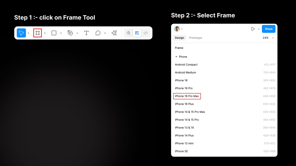
How to Select a Frame:
-
In the Figma toolbar, click on the Frame tool (F).
-
Select a pre-defined frame size based on the device you’re designing for (e.g., iPhone 16 Pro Max).
-
Adjust the frame size if needed to fit custom screen dimensions.
Step 3: Setting Up Grid
Grids in Figma help maintain consistent spacing, alignment, and structure across your design. Grids act as a guide to ensure that elements are properly aligned and spaced on the screen.
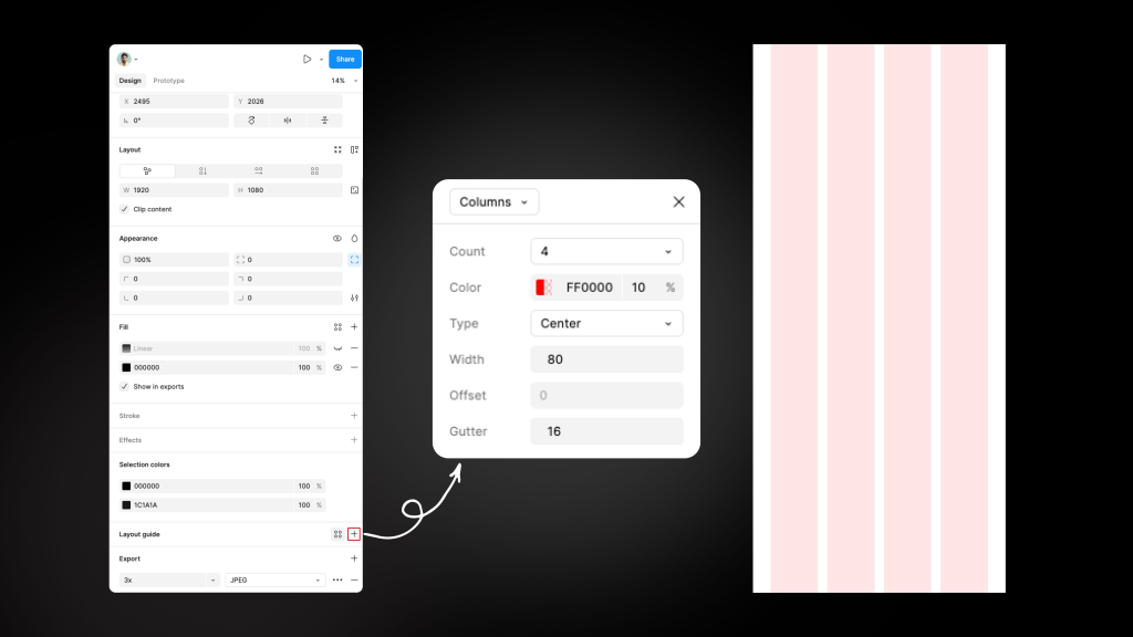
How to Set Up Grids:
-
Select the frame you’ve created.
-
In the right-hand panel, scroll to the Layout Grids section.
-
Click the plus sign (+) to add a grid and customize it:
-
Columns: Defines the vertical layout structure.
-
Rows: Defines horizontal spacing and structure.
-
Margins & Gutters: Adjust spacing between elements.
-
Make sure to use a 4-column grid for mobile designs, which is a common choice for ensuring flexible, responsive layouts.
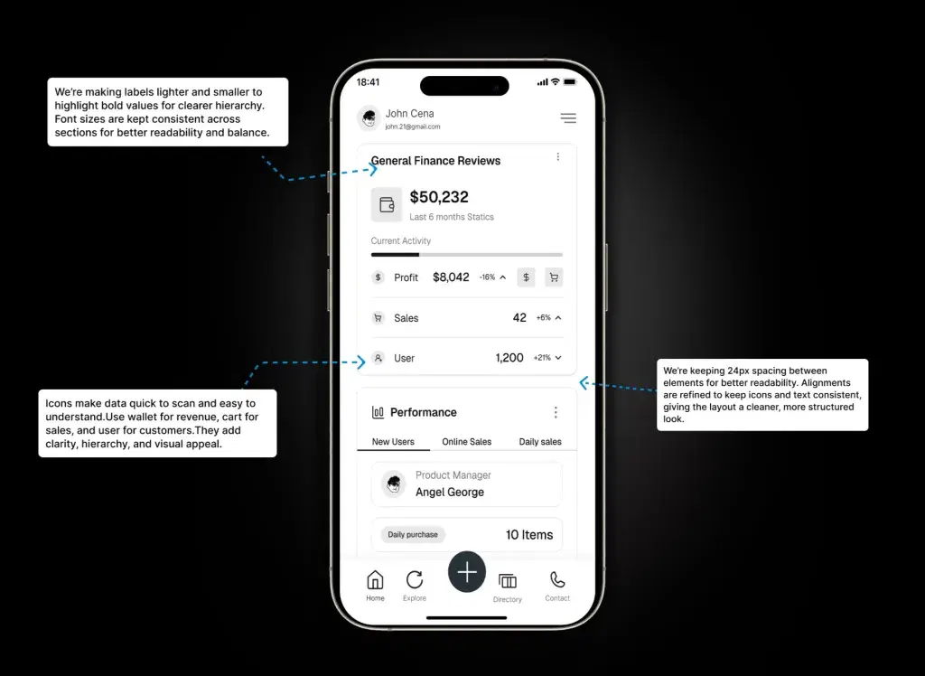
Step 4: Font Size and Color Structure
Font size and color are critical elements in mobile app design as they affect readability, visual hierarchy, and overall user experience. Figma allows you to use styles and variables to create consistent typography and color schemes throughout your design.
Font Size Structure
Font size plays a crucial role in ensuring that your text is readable and properly scaled on various screen sizes, while establishing a clear visual hierarchy for your app’s content.
How to Set Font Size:
-
Start with a base font size for body text, typically around 16px, which is a standard for mobile app text.
-
Define font sizes for headers (e.g., H1, H2) and body text to establish a clear typographic hierarchy.
-
Use line-height (typically 1.4x to 1.6x the font size) for comfortable readability, ensuring the text is not too cramped.
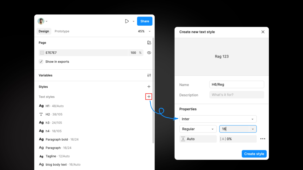
How to Apply Font Styles:
-
Figma allows you to create Text Styles for consistent typography. Once you’ve defined a font family, size, weight, and line-height, you can save it as a style by clicking on the Style icon in the text properties panel.
-
Create different styles for headings, subheadings, body text, and other text elements to maintain a uniform look across screens.
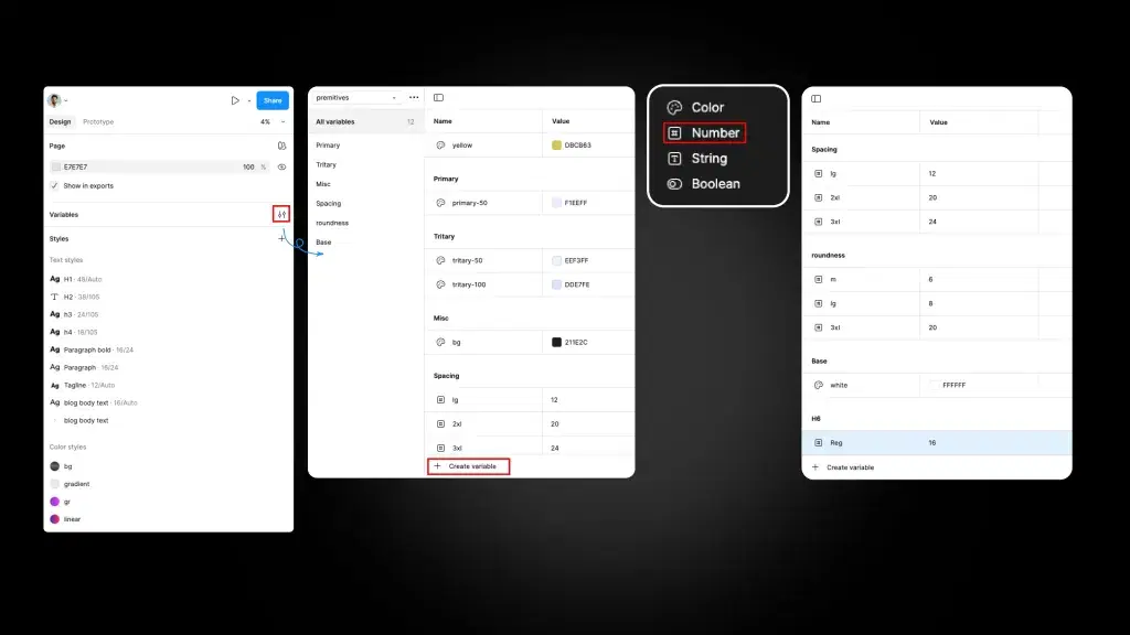
How to Apply Font Variables:
-
Go to Figma’s Variables panel and create a variable for each font property (e.g., base font size, header sizes).
-
Once variables are created, apply them to the relevant text elements across your design by selecting the variable from the Variables panel.
-
Any change made to the variable will automatically update all instances where it has been applied.
To avoid doing everything from scratch, you can use ready-to-use Shadcn Figma UI Kit. It is one of the largest premium Shadcn Figma UI kit that helps you to build faster, design smarter, and streamline your developer handoff.
It is the core product from shadcn/studio which is an awesome Shadcn UI Component library that also offer:
-
550+ Shadcn Blocks
-
20+ Shadcn Templates (Upcoming)
-
AI Powered Shadcn Theme Generator
-
Shadcn MCP - AI Shadcn Builder
Color Structure:
Color is an essential design element that defines your app’s identity, sets the tone, and helps with visual hierarchy. Consistent use of color enhances the user experience and provides better clarity.
How to Set Color Structure:
-
Use a color palette to create a consistent and accessible color scheme for your app. Typically, you should have primary, secondary, and neutral colors that reflect your brand identity.
-
It’s important to also consider contrast ratios for accessibility to ensure that text is legible against background colors.
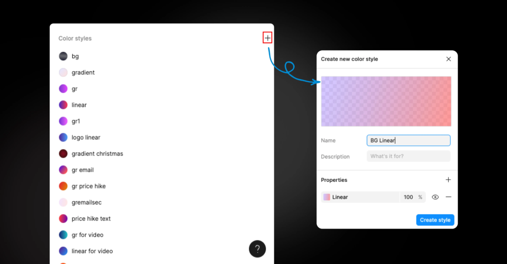
How to Apply Color Styles:
-
Select the element (e.g., text, buttons, backgrounds) you want to color.
-
In the right panel, click on the Fill color and choose from Color Styles (if you have predefined them) or manually select a color.
-
For text, assign color styles to maintain consistency across different types of text elements (e.g., body text, headings, links).
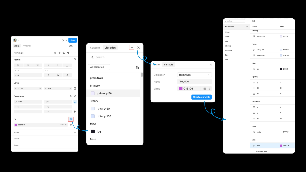
How to Apply Color Variables:
-
Define color variables in the Variables panel for key colors (e.g., primary, secondary, background).
-
Apply the color variables by selecting the element and choosing the appropriate color variable from the Variables panel.
-
Any updates made to the color variables will automatically reflect across the entire design where those variables are used.
Step 5: Using Auto Layout for Alignment and Spacing
Figma’s Auto Layout feature automates the alignment and distribution of elements within a frame or group. It saves time and helps maintain consistency as your design grows.
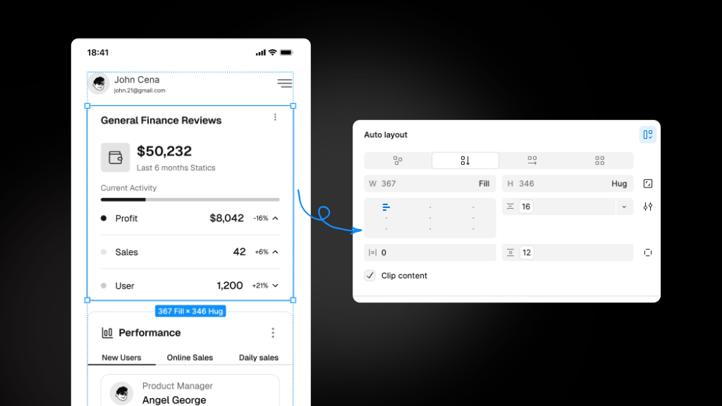
How to Use Auto Layout:
-
Select the frame or group of elements.
-
Right-click and choose Add Auto Layout or use shortcut Shift + A.
-
Adjust the alignment and spacing properties in the right-hand panel:
-
Padding: Set the space between the frame’s edges and its contents.
-
Spacing between items: Adjust how far apart elements are placed within a frame.
-
Alignment: Choose whether elements should be aligned to the left, center, or right of the frame.
-
With Auto Layout, components like buttons and text boxes automatically adjust as the content changes, making it easier to create responsive and flexible designs.
Conclusion:
Designing a mobile app in Figma can be a smooth and organized process if you follow these steps. By using wireframes, frames, grids, and Auto Layout, along with consistent font and color styles, you can create a polished and user-friendly design.
Figma’s powerful features make it easy to adjust, iterate, and collaborate on your app design to ensure it’s intuitive and visually appealing.