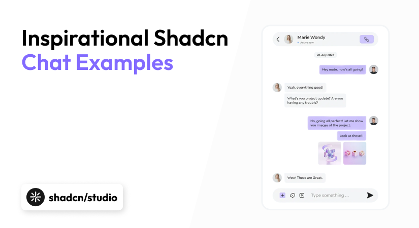
Shadcn UI brings modern, accessible UI components to React projects using Tailwind CSS. When building a chat interface, using Shadcn’s pre-built elements helps you create polished designs quickly. This article explores practical Shadcn Chat UI examples and how they solve common communication needs in apps.
Why Use Chat in a Project?
Chat interfaces have become essential components in modern applications, serving purposes far beyond simple messaging. Understanding when and why to implement a chat UI can significantly enhance your application’s functionality and user experience.
Key Reasons:
-
Enhances user engagement through natural, conversational interactions
-
Supports seamless AI and chatbot integration for modern applications
-
Enables real-time communication for instant messaging use cases
-
Improves customer support with faster, direct interactions
-
Boosts conversational commerce and personalized buying experiences
-
Simplifies document and data analysis through conversational queries
-
Reduces development time with ready-made chat UI components
-
Improves accessibility and inclusivity across user groups
-
Preserves context through conversation history
-
Delivers a mobile-first, user-friendly experience
Now, let’s check the top Shadcn Chat UI examples.
Top Shadcn Chat UI Examples:
Chat UIs have evolved from simple messaging tools into versatile interfaces capable of handling complex interactions, AI integration, and sophisticated workflows.
By leveraging modern chat UI components built with shadcn/ui, developers can rapidly implement professional, accessible chat experiences that meet diverse application needs - from AI chatbots to customer support systems to collaborative workspaces.
Below, we have gathered the best Shadcn Chat UI Examples which you can use in your project to make it interactive.
Zola - Open Source Shadcn Chat UI
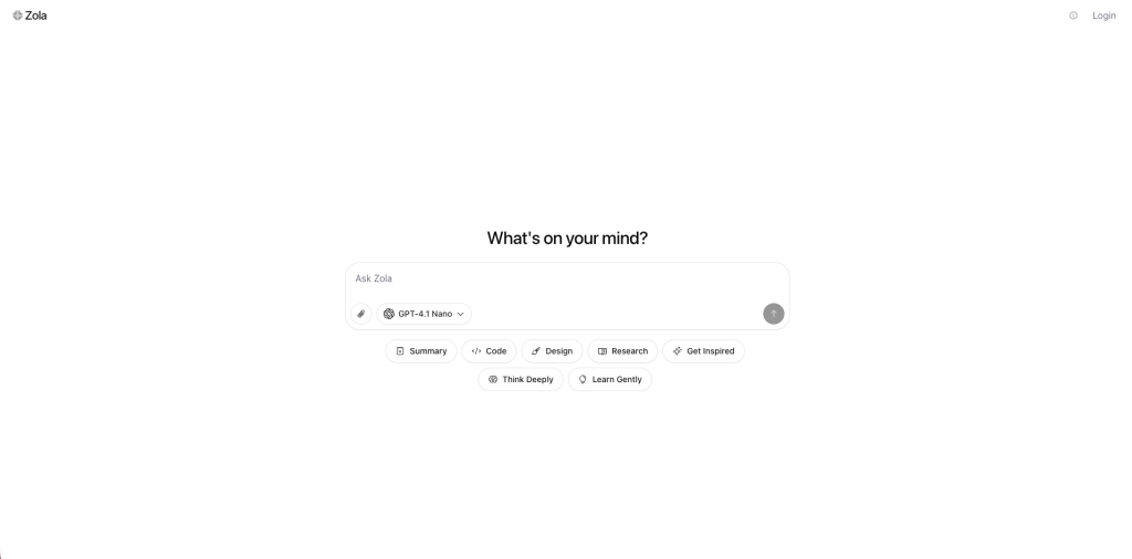
Zola is an open-source Shadcn chat UI that provides a unified platform for interacting with multiple AI models from different providers. Built with Next.js, shadcn/ui, and prompt-kit, it offers a clean, responsive interface that supports both cloud-based models and local AI through Ollama.
Zola emphasizes user control with Bring Your Own API Key (BYOK) support and self-hosting capabilities, making it a flexible solution for developers and AI enthusiasts.
Check the Github repo.
Features:
-
Multi-model support: OpenAI, Mistral, Claude, Gemini, Ollama (local models)
-
Bring your own API key (BYOK) support via OpenRouter
-
File uploads
-
Clean, responsive UI with light/dark themes
-
Built with Tailwind CSS, shadcn/ui, and prompt-kit
-
Open-source and self-hostable
-
Customizable: user system prompt, multiple layout options
-
Local AI with Ollama: Run models locally with automatic model detection
-
Full MCP support (wip)
Installation:
- Option 1: With Cloud Models (OpenAI)
git clone https://github.com/ibelick/zola.git
cd zola
npm install
echo "OPENAI_API_KEY=your-key" > .env.local
npm run dev- Option 2: With Local Models (Ollama)
# Install and start Ollama
curl -fsSL https://ollama.ai/install.sh | sh
ollama pull llama3.2  # or any model you prefer

# Clone and run Zola
git clone https://github.com/ibelick/zola.git
cd zola
npm install
npm run dev
Zola will automatically detect your local Ollama models!
- Option 3: Docker with Ollama
git clone https://github.com/ibelick/zola.git
cd zola
docker-compose -f docker-compose.ollama.yml up
For advanced features like authentication, file uploads, and storage, refer to the INSTALL.md guide.
Usage:
Once installed, Zola provides an intuitive chat interface:
-
Select Your Model: Choose from available cloud providers or local Ollama models
-
Configure Settings: Set your system prompt and customize the interface layout
-
Start Chatting: Interact with AI models through the clean chat interface
-
Upload Files: Attach documents for context-aware conversations
-
Switch Themes: Toggle between light and dark modes for comfortable viewing
Note: Zola is currently in beta, with an evolving codebase that may change as new features are added. The project is licensed under Apache License 2.0, making it free to use, modify, and distribute.
Prompt Kit - Open Source Shadcn Chat UI
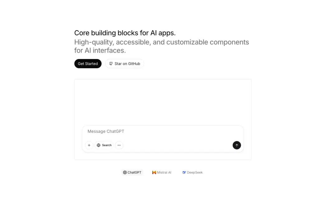
Prompt Kit provides customizable, high-quality components for building AI applications like chat experiences, AI agents, and autonomous assistants.
Built on top of shadcn/ui with the same design principles, it helps developers create beautiful AI interfaces quickly with React, Tailwind CSS, & TypeScript.
Check the GitHub Repo.
Features:
-
Prompt Input component for text entry and submission to AI models
-
Message component for displaying chat messages
-
Markdown renderer with GitHub Flavored Markdown (GFM) support
-
CodeBlock component with syntax highlighting
-
Chat Container with intelligent auto-scrolling
-
Response Stream for displaying text with streaming animations
-
File Upload with drag-and-drop support for single/multiple files
-
Loader component for indicating processing states
-
Reasoning component for displaying AI agent reasoning
-
Source, Steps, Tool, System Message, and other specialized AI components
-
Fully accessible and customizable component architecture
Installation:
-
First, install and configure shadcn/ui in your project by following the official installation guide
-
Install individual prompt-kit components using the shadcn CLI:
npx shadcn@latest add prompt-kit/[component]Replace [component] with the specific component name (e.g., prompt-input, message, markdown, code-block)
Usage:
import { PromptInput } from "@/components/ui/prompt-input";The components are backend-agnostic and work with any AI model or framework. Each component can be customized by modifying the source code directly in your project, similar to shadcn/ui’s philosophy.
Special Recommendation: shadcn/studio
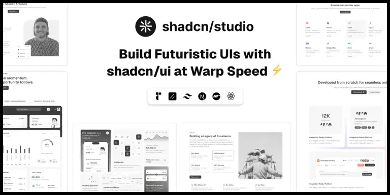
This isn’t a traditional component library or a replacement for Shadcn. Instead, it’s a unique collection that offers customizable variants of components, blocks, and templates. Preview, customize, and copy-paste them into your apps with ease.
Building on the solid foundation of the Shadcn components & blocks, we’ve enhanced it with custom-designed components & blocks to give you a head start. This allows you to craft, customize, and ship your projects faster and more efficiently.
Features:
-
Open-source: Dive into a growing, community-driven collection of copy-and-paste shadcn/ui components, Shadcn blocks, and templates.
-
Component & Blocks variants: Access a diverse collection of customizable shadcn ui blocks and component variants to quickly build and style your UI with ease.
-
Animated variants with Motion: Add smooth, modern animations to your components, enhancing user experiences with minimal effort.
-
Landing pages & Dashboards: Explore 20+ premium & free Shadcn templates for dashboards, landing pages & more. Fully customizable & easy to use.
-
shadcn/ui for Figma: Speed up your workflow with Shadcn Figma Kit UI components, blocks & templates — a full design library inspired by shadcn/ui.
-
Powerful theme generator: Customize your UI instantly with Shadcn Theme Generator. Preview changes in real time and create consistent, on-brand designs faster.
-
shadcn/studio MCP: Integrate shadcn/studio MCP Server directly into your favorite IDE and craft stunning shadcn/ui Components, Blocks, and Pages inspired by shadcn/studio.
-
Shadcn Figma To Code Plugin: Convert your Figma designs into production-ready code instantly with the Shadcn Figma Plugin.
Soho - Shadcn UI Chat Template
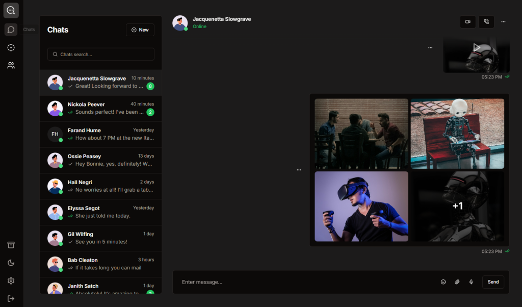
Soho is a premium Next.js template designed for creating chat and messaging applications. Built with Next.js, Tailwind CSS, shadcn/ui, and Framer Motion, it provides a complete foundation for building modern chat interfaces. This template is part of the larger Shadcn UI Kit ecosystem that includes admin dashboards, website templates, and UI components.
Features:
-
Built with Nextjs, Tailwind CSS & Framer motion
-
Modern, minimal & clean design
-
Dark mode
-
Typescript support
-
Mobile responsive
-
SEO Optimized
-
Easy to deploy
The template also provides ready-to-use pages and components:
-
Chat List: Displays all conversations with message previews
-
Message View: Full conversation interface with message threading
-
Contact List: Manage and view contact details
-
Settings: User preferences and configuration
-
Call Modals: Handle incoming voice/video calls
Installation:
-
Purchase the Soho template or get it as part of the complete Shadcn UI Kit bundle.
-
After purchase, access the source code through GitHub
-
Clone the repository:
git clone [repository-url]
cd soho-chat-template- Install dependencies:
npm install
# or
pnpm install
# or
yarn install- Run the development server:
npm run devShadcn Style Chat UI
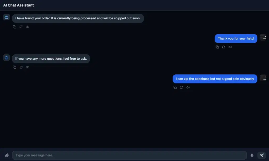
This Shadcn Style Chat UI is a Vue.js implementation that demonstrates a clean, modern AI chat interface inspired by Shadcn design principles.
The example showcases a fully functional chat application with streaming responses, avatars, message actions, and a polished user experience. Built with Vue 3, Tailwind CSS, and Lucide icons, it provides developers with a practical reference for implementing AI chat interfaces.
Features:
-
Clean, modern design inspired by shadcn UI components
-
User and AI avatars with a robot icon for AI messages
-
Streaming text responses from backend API
-
Message actions, including copy, refresh, and volume controls
-
Dark mode support with a carefully chosen color scheme
-
Responsive layout optimized for different screen sizes
Installation:
- Set up a Vue 3 project if you haven’t already:
npm create vue@latest
cd your-project-name
npm install-
Install Tailwind CSS in your Vue project following the official guide
-
Install Lucide Vue icons:
npm install lucide-vue-next-
Copy the component code into your project (e.g.,
components/AIChatInterface.vue) -
Set up your backend API endpoint at
http://localhost:5000/api/stream-responseto handle streaming responses
Shadcn Svelte Chat UI
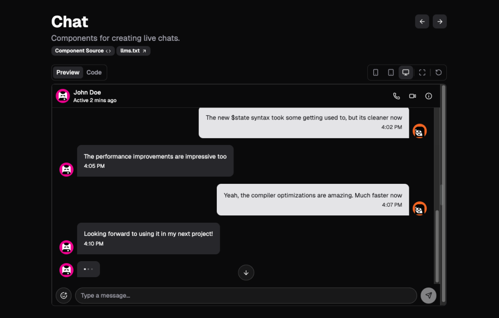
Shadcn Svelte Chat Component is a composable, production-ready chat interface designed specifically for Svelte applications. Part of the larger shadcn-svelte-extras ecosystem, this component extends the original shadcn-svelte library by providing additional UI primitives needed to build complete applications.
Built with the same design principles of quality, composability, and style as shadcn-svelte, it enables developers to create live chat interfaces with minimal effort while maintaining full customization control.
Check out the GitHub Repo.
Features:
-
Chat.List component as the root container for chat messages
-
Chat.Bubble component for individual message containers with variant support
-
Chat.BubbleMessage for message content with an optional typing indicator
-
Chat.BubbleAvatar for user/bot avatars with full Avatar.Root inheritance
-
Built with Svelte 5 and optimized for performance
-
Tailwind CSS v4 integration for modern styling
-
Open-source under MIT license
Installation:
-
Ensure you have shadcn-svelte installed in your project
-
Install the chat component using the jsrepo CLI:
npx jsrepo add @ieedan/shadcn-svelte-extras/chat- The component will be added to your project with all necessary dependencies.
Usage:
- The Chat component uses a composable API pattern, allowing you to build custom chat interfaces:
<script lang="ts">
  import * as Chat from '$lib/components/ui/chat';
</script>

<Chat.List>
  <!-- User Message -->
  <Chat.Bubble variant="sent">
    <Chat.BubbleAvatar src="/user-avatar.png" />
    <Chat.BubbleMessage>
      Hey, did you see Svelte 5 just got released?
    </Chat.BubbleMessage>
  </Chat.Bubble>

  <!-- AI/Bot Message -->
  <Chat.Bubble variant="received">
    <Chat.BubbleAvatar src="/bot-avatar.png" />
    <Chat.BubbleMessage>
      Yes! The runes system looks really interesting!
    </Chat.BubbleMessage>
  </Chat.Bubble>

  <!-- Message with typing indicator -->
  <Chat.Bubble variant="received">
    <Chat.BubbleAvatar src="/bot-avatar.png" />
    <Chat.BubbleMessage typing={true}>
      Typing...
    </Chat.BubbleMessage>
  </Chat.Bubble>
</Chat.List>
The component is designed to handle various chat scenarios, including one-on-one messaging, group chats, AI chatbots, customer support interfaces, and more. Its composable nature ensures you’re never locked into a specific implementation pattern.
Shadcn Chatbot Kit
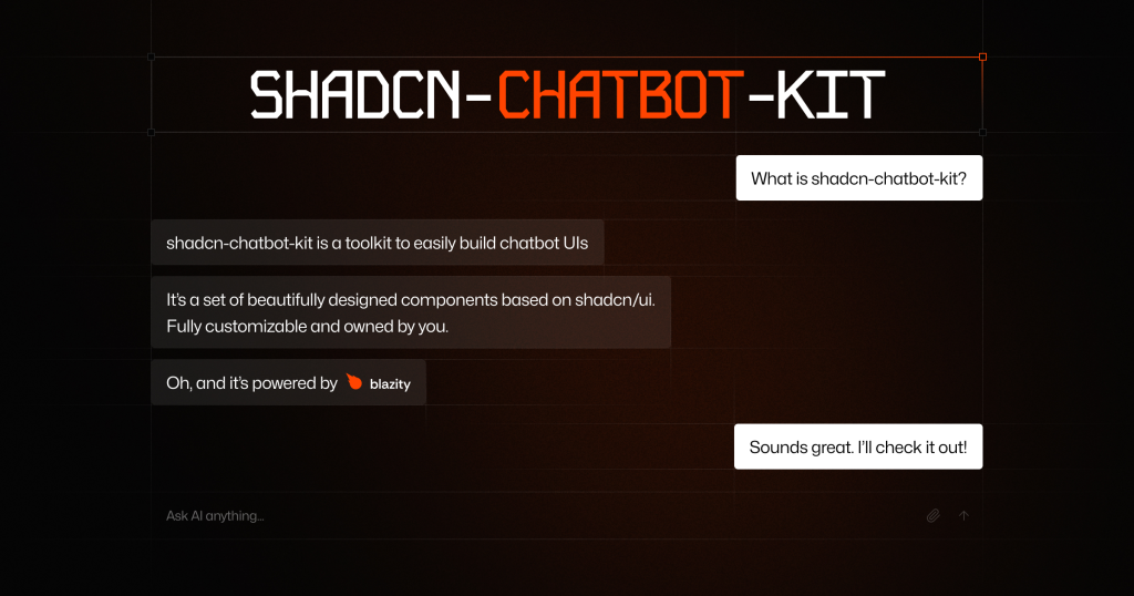
Shadcn Chatbot Kit is a comprehensive chatbot component kit built on top of and fully compatible with the shadcn/ui ecosystem.
It enables developers to create beautiful, customizable AI chatbots in minutes while maintaining full control over their components. The kit uses a copy-and-paste approach, letting you install only what you need and own your components.
Check out the GitHub Repo.
Features:
-
Rich chat interface with beautiful interactions and animations
-
Advanced attachment handling with smart preview for uploaded files and auto-conversion of long text to attachments
-
Markdown support with syntax highlighting
-
Thinking process visualization showing LLM reasoning and thought process (WIP)
-
Tool integration with visual execution states, cancel support, and smart interrupt prompts
Installation:
-
First, follow the installation instructions for shadcn/ui in your project.
-
Ensure you’re using the modern
shadcnCLI (not the legacyshadcn-ui). -
Install components using the CLI:
npx shadcn@latest add [component-name]- For detailed installation instructions and a full list of available components, visit the official documentation.
Usage:
"use client"

import { useChat } from "ai/react"
import { Chat } from "@/components/ui/chat"

export function ChatDemo() {
  const { messages, input, handleInputChange, handleSubmit, status, stop } =
    useChat()

  const isLoading = status === 'submitted' || status === 'streaming'

  return (
    <Chat
      messages={messages}
      input={input}
      handleInputChange={handleInputChange}
      handleSubmit={handleSubmit}
      isGenerating={isLoading}
      stop={stop}
    />
  )
}
Note: This example uses the Vercel AI SDK. Follow the official Getting Started guide before implementing.
All components are fully customizable using CSS variables and can be styled through shadcn/ui’s theming system. Visit the theme customizer to visually design your chatbot’s appearance.
LLM AI Chat
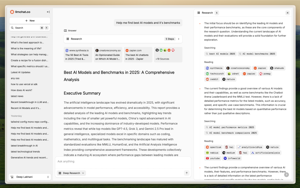
LLMChat.co is a sophisticated open-source AI chatbot platform built with Next.js, TypeScript, and shadcn/ui that prioritizes user privacy while delivering powerful research and agentic workflow capabilities.
Unlike traditional chat interfaces, it offers specialized modes, including Pro Search and Deep Research for in-depth analysis of complex topics. All user data is stored locally in the browser using IndexedDB, ensuring conversations never leave your device while providing enterprise-grade AI capabilities.
Check out the GitHub repo.
Features:
-
Supports various LLM providers, including: OpenAI, Anthropic, Google, Grok, etc
-
Enhance functionality with an expandable plugin system, including function-calling capabilities.
-
Allows AI to fetch and utilize real-time web data.
-
Create and tailor AI assistants for specific tasks or domains.
-
Converts AI-generated text responses to speech using Whisper.
-
Speech-to-Text: (Coming soon) Enables voice input for more natural interaction.
-
Securely store data locally using in-browser IndexedDB for faster access and privacy.
-
Easily import or export chat data for backup and migration.
Installation:
- Clone the repository
git clone https://github.com/your-repo/llmchat.git
cd llmchat- Install dependencies:
bun install
# or
yarn install- Start the development server:
bun dev
# or
yarn dev- Open your browser and navigate to
http://localhost:3000
Conclusion:
A customer support chat interface built with Shadcn focuses on clarity and ease of use. It highlights unread messages, uses distinct colors for user vs. agent messages, and includes quick action buttons. Such examples are ideal for help-desk pages or in-app support widgets.
Shadcn also supports media-rich messaging. By adding components for images, emojis, and file attachments, the chat UI becomes more expressive. These Shadcn chat ui examples demonstrate how flexible Shadcn components handle varied content without extra styling overhead.
In conclusion, Shadcn Chat UI examples show how to build chat screens that are functional, responsive, and visually appealing with minimal effort. Whether for social apps, support systems, or internal tools, Shadcn’s component-driven approach speeds up development while keeping interfaces consistent and user-friendly.