In this blog, we’ll explore what an animation library is, why it matters, and then deep-dive into the Super 7 Shadcn Animation Library options that developers and designers love.
What Is Animation Library?
An animation library is a prebuilt set of tools and functions that helps developers add animations and motion effects to websites or applications without building everything from scratch.
Instead of manually calculating positions, timings, easing curves, and transitions, an animation library gives you ready-to-use APIs to animate elements like text, buttons, images, cards, charts, and entire page sections smoothly and efficiently.
Benefits of Animation Library
-
Faster development with prebuilt animation utilities
-
Improved user experience through smooth interactions
-
High-performance animations optimized for modern browsers
-
Consistent behavior across different browsers and devices
-
Cleaner, more maintainable code structure
-
Easy implementation of advanced effects like scroll and timeline animations
-
Reusable animation patterns across projects
-
Better support for responsive and interactive interfaces
The Best Shadcn Animation Library
Modern web interfaces are no longer just about clean layouts and good typography - motion and interaction play a huge role in user experience. If you’re building products with Shadcn UI, pairing it with the right animation libraries can dramatically elevate how your interface feels and performs.
Checkout the best Shadcn Animation Library below:
Magic UI
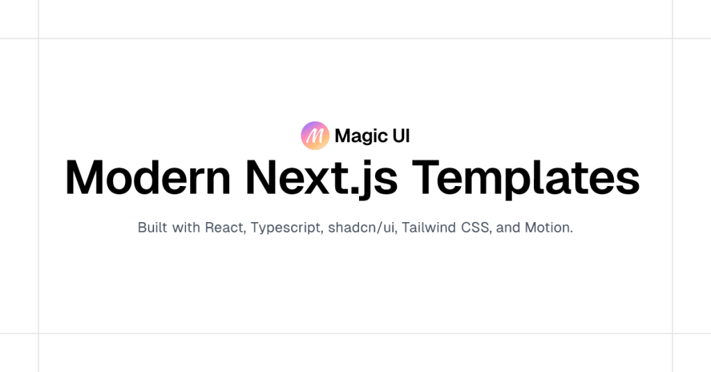
Magic UI lives up to its name by offering delightful animations that feel smooth and polished. The components are simple to integrate and highly customizable.
Key Features:
-
Beautiful motion effects
-
Simple API and clean code
-
Tailwind-first approach
-
Works seamlessly with Shadcn UI
Best For: Feature sections, hero areas, and interactive cards.
Installation:
- Initialize shadcn/ui & run the
lintcommand to create a new project with shadcn/ui or set up an existing one
pnpm dlx shadcn@latest init
or
npx shadcn@latest init
or
yarn shadcn@latest init
or
bunx --bun shadcn@latest init- Add components
pnpm dlx shadcn@latest add @magicui/globe
or
npx shadcn@latest add @magicui/globe
or
yarn shadcn@latest add @magicui/globe
or
bunx --bun shadcn@latest add @magicui/globe- The command above will add the
Globecomponent to your project. You can then import it like this:
import { Globe } from "@/components/ui/globe"

export default function Home() {
  return <Globe />
}
Animate UI
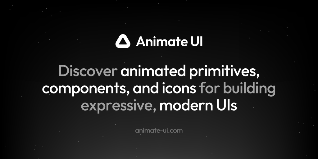
Animate UI is a clean and minimal animation library designed specifically for modern React and Shadcn projects. It offers smooth, elegant motion components that are easy to plug into existing layouts.
Key Features:
-
Ready-to-use animated UI components
-
Tailwind and Shadcn friendly
-
Lightweight and performance-optimized
-
Ideal for subtle, professional animations
Best For: SaaS dashboards, landing pages, and product UIs.
Installation:
- Initialize shadcn/ui & run the
lintcommand to create a new project with shadcn/ui or set up an existing one
pnpm dlx shadcn@latest init
or
npx shadcn@latest init
or
yarn shadcn@latest init
or
bunx --bun shadcn@latest init- Run
addcommand to add a component to your project
pnpm dlx shadcn@latest add @animate-ui/primitives-texts-sliding-number
or
npx shadcn@latest add @animate-ui/primitives-texts-sliding-number
or
npx shadcn@latest add @animate-ui/primitives-texts-sliding-number
or
bunx --bun shadcn@latest add @animate-ui/primitives-texts-sliding-number- Import the component into your project
import { SlidingNumber } from '@/components/animate-ui/primitives/texts/sliding-number';

export default function Home() {
  return (
    <div>
      <SlidingNumber />
    </div>
  );
}
Shadcn Studio
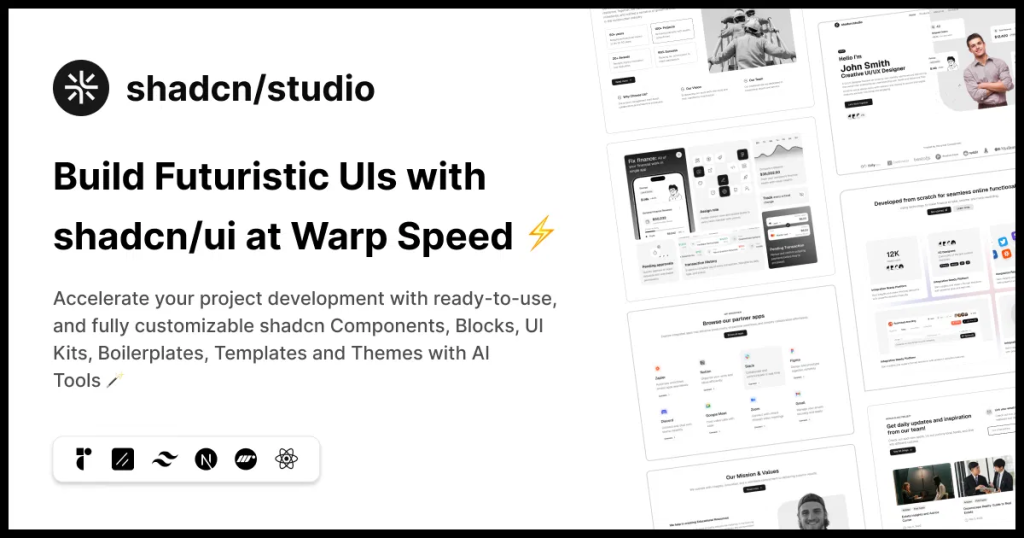
Shadcn Studio goes beyond animations by providing animated blocks and sections built on top of Shadcn UI. It’s perfect for teams that want speed without compromising design quality.
Key Features:
-
Pre-animated components, blocks, and layouts
-
Built specifically for Shadcn UI
-
Consistent motion patterns
-
Great for marketing and landing pages
Furthermore, Animated variants with motion add smooth, modern animations to your components, enhancing user experiences with minimal effort.
Best For: Startups, agencies, and rapid MVP development.
Additionally, it comes with the following features:
-
Open-source: Dive into a growing, community-driven collection of copy-and-paste shadcn components, Shadcn blocks, and templates.
-
Component & Blocks variants: Access a diverse collection of customizable shadcn UI blocks and component variants to quickly build and style your UI with ease.
-
Landing pages & Dashboards: Explore 20+ premium & free Shadcn templates for dashboards, landing pages & more. Fully customizable & easy to use.
-
shadcn/ui for Figma: Speed up your workflow with Shadcn Figma UI kit with components, blocks & templates – a full design library inspired by shadcn/ui.
-
Powerful theme generator: Customize your UI instantly with Shadcn Theme Generator. Preview changes in real time and create consistent, on-brand designs faster.
-
shadcn/studio MCP: Integrate shadcn/studio MCP Server directly into your favorite IDE and craft stunning shadcn/ui Components, Blocks, and Pages inspired by shadcn/studio.
-
Shadcn Figma To Code Plugin: Convert your Figma designs into production-ready code instantly with the Shadcn Figma Plugin.
Acernity UI
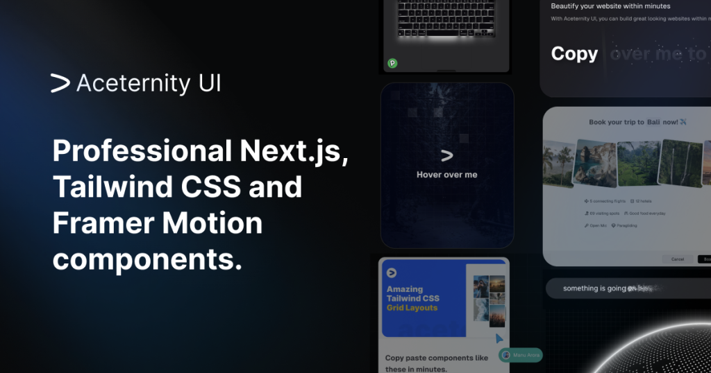
Acernity UI is known for its high-impact animations and visually rich components. This shadcn animation library is perfect if you want your product to feel bold, interactive, and premium.
Key Features:
-
Eye-catching animations
-
Interactive hover and scroll effects
-
Modern, futuristic UI patterns
-
Shadcn-compatible components
Best For: Creative websites, portfolios, and AI products.
Installation:
- Start with a React/Next.js app, install Tailwind CSS, and set up shadcn/ui using
npm i framer-motion clsx tailwind-merge-
Ensure
lib/utils.tsexists to handle class merging (standard in shadcn). -
Add dependencies
npm i three three-globe @react-three/fiber @react-three/drei- Add components CLI Method: Run
npx shadcn@latest add
https://ui.aceternity.com/registry/[component].jsonOR
- Copy the code directly from the component page on the Aceternity website and paste it into
components/ui/[component-name].tsxSmooth UI
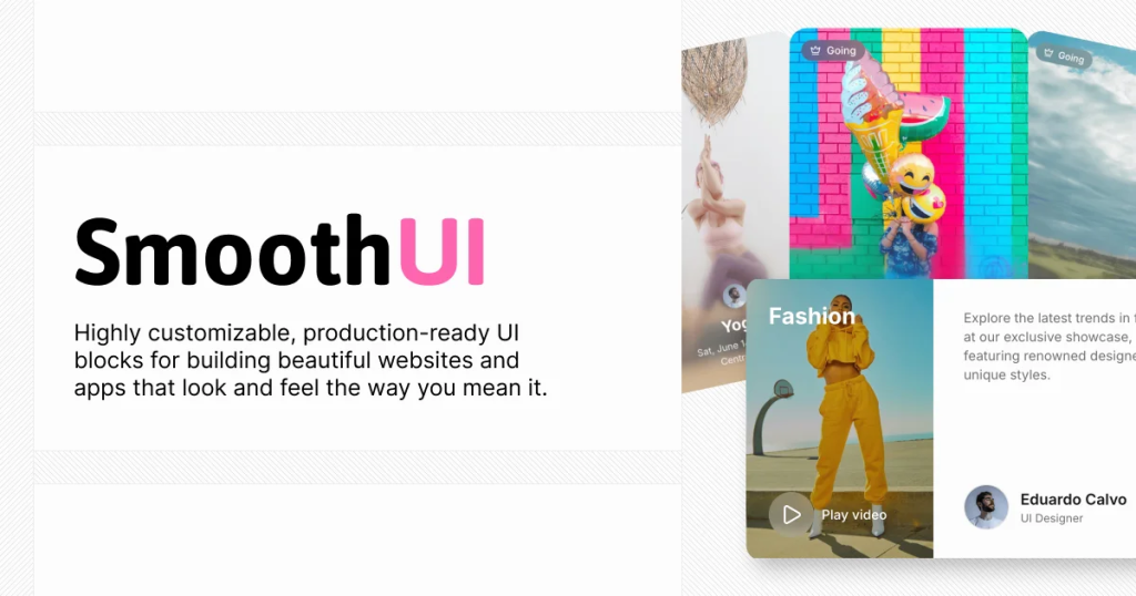
Smooth UI focuses on micro-interactions and fluid transitions that enhance usability without overwhelming users.
Key Features:
-
Subtle animation components
-
Excellent performance
-
Minimal and elegant motion
-
Easy Shadcn integration
Best For: SaaS products, admin panels, and enterprise apps.
Installation:
-
SmoothUI is an official shadcn registry, so you can install components directly without any configuration. Just use the
@smoothuinamespace. -
Install SmoothUI components using the shadcn CLI with the
@smoothuinamespace:
# Install a single component
pnpm dlx shadcn@latest add @smoothui/siri-orb

# Install multiple components
pnpm dlx shadcn@latest add @smoothui/rich-popover @smoothui/animated-input

# Install components with dependencies
pnpm dlx shadcn@latest add @smoothui/scrollable-card-stack- Import and use the installed components in your React application:
import { SiriOrb } from "@/components/smoothui/ui/SiriOrb"
import { RichPopover } from "@/components/smoothui/ui/RichPopover"

export default function App() {
  return (
    <div>
      <SiriOrb size="200px" />
      <RichPopover />
    </div>
  )
}
Cult UI
Cult UI delivers bold, modern animation components that help your product stand out. This shadcn animation library is especially popular among designers who want expressive UI motion.
Key Features:
-
Unique animation styles
-
High-quality interactive components
-
Shadcn-ready architecture
-
Great visual appeal
Best For: Creative projects, branding-focused websites, and experimental UIs.
Installation:
- To get started, ensure you have the following dependencies installed:
pnpm add -D tailwindcss@latest clsx tailwind-merge framer-motion
or
npm install -D tailwindcss@latest clsx tailwind-merge framer-motion
or
yarn add -D tailwindcss@latest clsx tailwind-merge framer-motion
or
bun add -D tailwindcss@latest clsx tailwind-merge framer-motion-
For projects using shadcn CLI v3, you can configure the Cult UI registry to install components directly via the command line.
-
Add the Cult UI registry to your
components.jsonfile:
{
  "$schema": "https://ui.shadcn.com/schema.json",
  "style": "new-york",
  "rsc": true,
  "tsx": true,
  "tailwind": {
    "config": "",
    "css": "app/globals.css",
    "baseColor": "neutral",
    "cssVariables": true,
    "prefix": ""
  },
  "aliases": {
    "components": "@/components",
    "utils": "@/lib/utils",
    "ui": "@/components/ui",
    "lib": "@/lib",
    "hooks": "@/hooks"
  },
  "iconLibrary": "lucide",
  "registries": {
    "@cult-ui": "https://cult-ui.com/r/{name}.json"
  }
}
Berlix UI
Berlix UI offers a collection of stylish components with built-in animations that align perfectly with modern Shadcn design systems.
Key Features:
-
Animated UI components
-
Developer-friendly structure
-
Customizable motion styles
-
Tailwind and React-based
Best For: Developers looking for animation + design consistency.
Installation:
- CLI Installation
npx shadcn-ui@latest init- Then install components:
npx shadcn@latest add "https://ui.rechesoares.com/registry/<component-name>.json"-
Replace
<component-name>with the component you want (e.g.,button,card,input). -
Or Copy-Paste from Docs. If you prefer direct control, simply copy-paste the JSX/TSX code into your project.
When Should You Use an Animation Library?
Use Shadcn Animation Library if:
-
Your website relies on interactive UI
-
You want polished micro-interactions
-
You’re building landing pages, SaaS dashboards, or product websites
-
You care about performance and scalability
Conclusion:
Choosing the right Shadcn Animation Library can significantly improve how users experience your product. Whether you prefer subtle micro-interactions or bold, expressive motion, the Super 7 Shadcn Animation Library options listed above cover every use case.
If you want:
-
Clean and professional motion → Animate UI / Smooth UI
-
Pre-built animated sections → Shadcn Studio
-
High-impact visuals → Aceternity UI / Cult UI
Pairing Shadcn UI with the right animation library helps you build interfaces that are not just functional, but memorable.