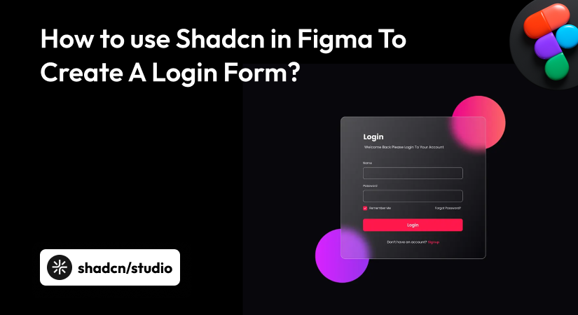
Design systems are evolving, and shadcn has quickly become one of the most discussed UI approaches in modern web development. Because shadcn is code-first, designers often struggle to understand how it fits into tools like Figma.
This guide explains how designers can use shadcn in Figma by focusing on design systems, tokens, and real UI composition.
What is shadcn?
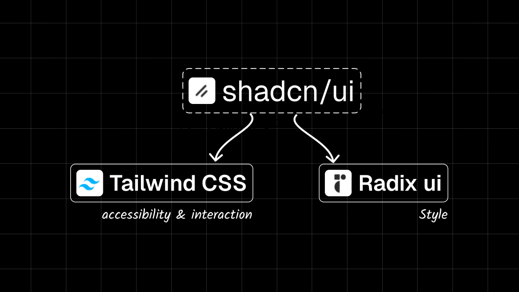
shadcn/ui is a collection of reusable, accessible UI components for modern web applications. Unlike traditional UI libraries, shadcn does not provide a pre-styled or packaged UI system.
Instead, components are copied directly into the codebase, built on Radix UI for accessibility and interaction, and styled using Tailwind CSS.
From a design perspective, shadcn functions as a structural UI framework rather than a visual one. It defines how components behave and scale, while designers are responsible for defining colors, typography, spacing, and overall visual consistency through design tokens.
This makes shadcn particularly effective for teams that treat design systems as first-class products rather than static UI kits.
What Is a UI Kit?
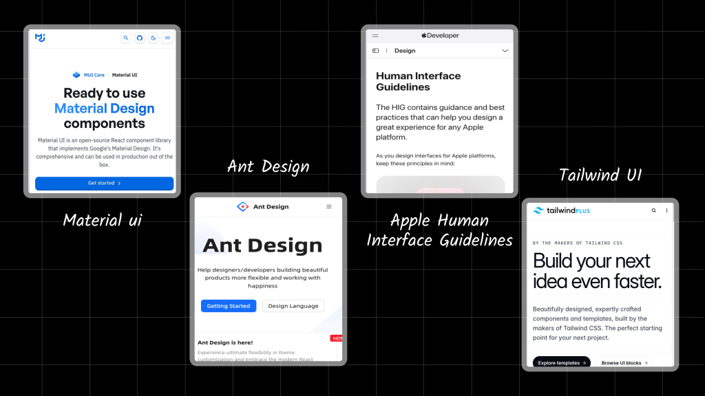
A UI kit is a collection of pre-designed interface components used to build products quickly and consistently. UI kits usually include:
-
Buttons and inputs
-
Forms and navigation
-
Typography and color systems
-
Spacing and layout rules
Examples of popular UI kits:
-
Material UI – Google’s opinionated design system
-
Ant Design – Enterprise-focused UI framework
-
Apple Human Interface Guidelines – Platform-specific UI standards
-
Tailwind UI – Pre-designed components for Tailwind projects
Most UI kits come with predefined visual styles and official Figma files. Shadcn intentionally does not.
Special Mention: Shadcn Figma UI Kit by Shadcn Studio
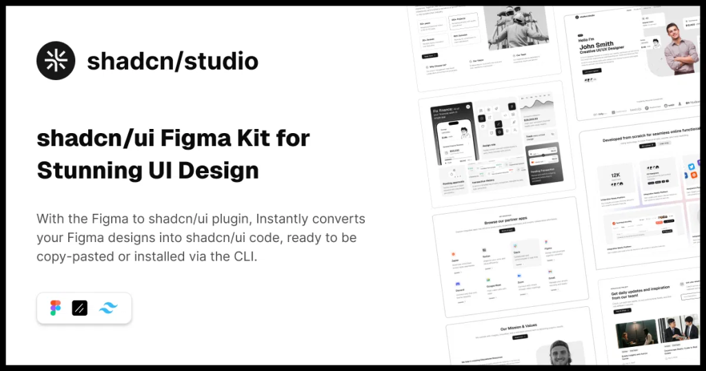
The largest premium Shadcn Figma UI kit - build faster, design smarter, and streamline your design-to-code process.
Features:
-
1500+ SVG Icons
-
70+ Shadcn/UI Charts
-
10 Landing Pages
-
Drag and Drop Builder
Apart from this, with Shadcn Studio you will also get:
-
700+ Shadcn Blocks
-
1000+ Shadcn Component and Animated Variants
-
Largest Shadcn Figma UI Design System
-
AI-Powered Shadcn Theme Generator
-
Shadcn Figma to Code Plugin & much more.
Why Shadcn?
Shadcn solves many limitations of traditional UI kits.
Why teams choose Shadcn:
-
No dependency lock-in
-
Full ownership of components
-
Easy long-term customization
-
Better scalability for design systems
Why this matters for designers:
-
You are not constrained by a preset visual style
-
Design tokens become the source of truth
-
Figma and code can stay closely aligned
-
Systems scale better than static UI kits
shadcn works best when designers think in tokens, variants, and composition, not just screens.
How to use Shadcn in Figma
Shadcn Design Tokens: Colors, Typography, and Radius
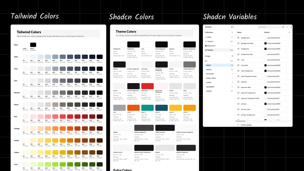
Shadcn relies heavily on design tokens, which define how the UI looks and behaves consistently across the entire product. These tokens act as a shared language between design and code, making them especially important for designers working in Figma.
Color Tokens
Shadcn uses semantic color tokens instead of hard-coded colors. Each token has a specific role in the UI.
-
backgroundUsed for the main page or application background. -
foregroundUsed for the primary text and icons displayed on the main background. -
cardUsed as the background color for surfaces such as cards, modals, and popovers. -
card-foregroundUsed for text and icons that appear inside cards or surface containers. -
primaryUsed for primary actions such as main buttons and highlights. -
secondaryUsed for secondary actions or less prominent UI elements. -
mutedUsed for subtle backgrounds, helper text, and disabled states. -
borderUsed for outlines, dividers, and input borders. -
destructiveUsed for error states, warnings, and destructive actions.
Typography Tokens
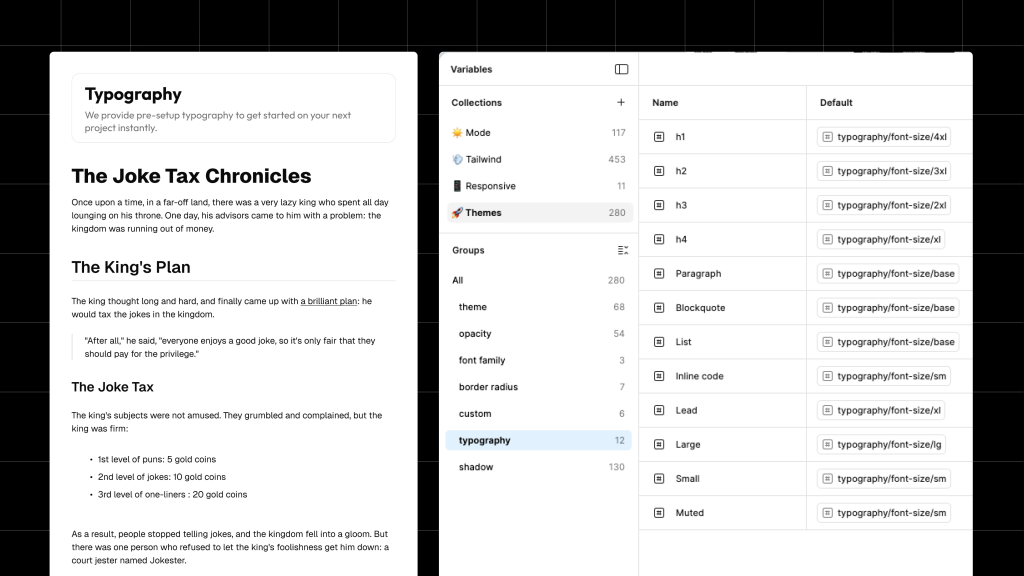
Shadcn follows Tailwind CSS typography conventions, which keep font sizing predictable and scalable.
-
text-sm– 14px (helper text, labels, captions) -
text-base– 16px (body text, inputs) -
text-lg– 18px (section titles, emphasis text)
Radius Tokens
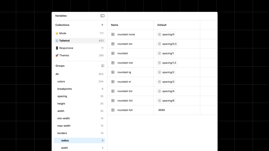
shadcn uses a minimal and consistent border-radius scale to keep UI surfaces visually coherent.
-
sm– Small radius (inputs, checkboxes) -
md– Medium radius (buttons, cards) -
lg– Large radius (modals, dialogs
Designing a Login Form Using shadcn Design Tokens
Let’s apply everything in a real example.
-
Create the Card container
-
Add a Frame and apply Auto Layout (Vertical).
-
Set the background color to your
Theme / Cardtoken. -
Apply corner radius: 14px (as shown in the image).
-
Use the default horizontal card padding from your design system.
-
-
Add logo, title, and subtext (top section)
-
Inside the card, add another Auto Layout (Vertical) frame.
-
Center-align items horizontally.
-
Add:
-
Logo icon at the top
-
Title text:
-
Text: Welcome Back
-
Style:
Card Foreground -
Size: 2xl
-
Weight: Semibold
-
-
Subtext:
-
Text: Please enter your details to sign in
-
Style:
Muted Foreground -
Size: Base / Regular
-
-
-
-
Spacing
-
Maintain consistent vertical spacing between:
-
Logo → Title
-
Title → Subtext
-
-
Follow your spacing tokens (as indicated in the image, ~24px between major elements).
-
-
Text color tokens
-
Title uses Card Foreground
-
Subtext uses Muted Foreground
-
Avoid manual colours—only use design tokens.
-
-
Prepare for form content
- Keep this top section inside the main card Auto Layout so the form elements can stack naturally below it.
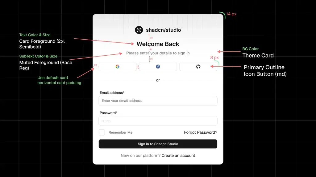
Add form fields, a checkbox, and a primary action
-
Email input field
-
Use the default Input component.
-
Settings:
-
Size: md
-
Shape: Rounded
-
State: Default
-
-
Label:
-
Text: Email address
-
Color:
Foreground -
Size: Sm / Medium
-
-
Placeholder:
-
Text: Enter your email address
-
Color:
Muted Foreground -
Size: Sm / Medium
-
-
Border:
- Use the Input Border color token.
-
Spacing:
- 8px between label and input.
-
-
Password input field
-
Duplicate the Email input for consistency.
-
Label:
-
Text: Password
-
Color:
Foreground -
Size: Sm / Medium
-
-
Keep the same:
-
Input size (md)
-
Border color token
-
Rounded shape
-
-
Maintain 16px vertical spacing between input groups.
-
-
Remember Me + Forgot Password row
-
Create a horizontal Auto Layout container.
-
Left side:
-
Use the default Checkbox component.
-
Label text: Remember Me
-
Text color:
Muted Foreground
-
-
Right side:
-
Text link: Forgot Password?
-
Text color:
Foreground (Base / Regular)
-
-
Align items vertically center and justify space-between.
-
-
Primary action button
-
Use Primary Solid Button (md).
-
Text: Sign in to Shadcn Studio
-
Text color:
Muted Foreground (Base / Regular) -
Width: Full
-
Add 24px spacing above the button.
-
-
Footer helper text
-
Text: New on our platform?
- Color:
Muted Foreground (Base / Regular)
- Color:
-
Action text: Create an account
- Color:
Foreground (Base / Regular)
- Color:
-
Center-align text.
-
Keep inside the same card with default horizontal card padding.
-
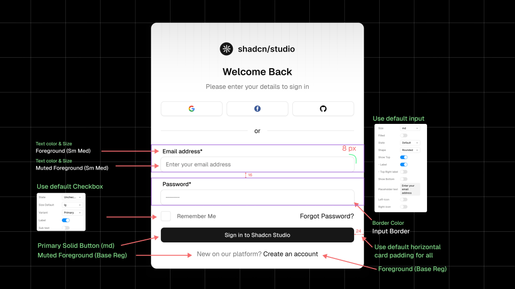
Compose the login form
Assemble primitives into:
-
Email input
-
Password input
-
Primary button
-
Secondary text link
Do not flatten everything into a single component. Composition is central to how shadcn works.
Final Thoughts
Using shadcn in Figma is not about importing a UI kit - it’s about designing a system that mirrors how shadcn works in code. When designers focus on tokens, reusable primitives, and composition, Figma becomes a reliable extension of the production UI.
That alignment is what makes shadcn powerful for modern design systems.