Using Shadcn Studio Figma to design an app, such as Shadcn Chat App, can be a great choice because Shadcn’s design philosophy emphasizes clean layouts, accessible components, and a developer-friendly structure. Below is a practical, end-to-end approach you can follow to create a modern, scalable chat interface.
How will we use Figma to design an app?
A practical approach to designing a clean, scalable AI chat interface using Shadcn Figma UI Kit by Shadcn Studio. In this guide, you will get to understand about building chat UI App just like above.
Understanding AI Chat Apps from a Design Perspective
AI chat apps are conversation-first interfaces. Unlike traditional apps that rely on navigation and screens, users interact mainly through prompts and responses. The UI should stay minimal, calm, and distraction-free to keep the focus on reading and typing.
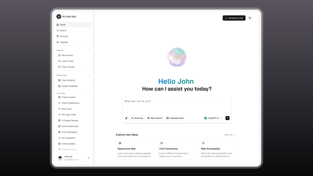
Most AI chat apps follow a simple, proven layout:
-
A sidebar for chat history, projects, and saved conversations
-
A central conversation area for AI responses and user prompts
-
A chat input at the bottom, often enhanced with prompt tools like reasoning modes or image generation
Supporting features such as temporary chats, language options, and account controls should remain easily accessible but visually subtle.
At this stage, design should prioritise core usability, chat flow, message layout, and input behaviour—over visual effects. A successful AI chat UI feels invisible, allowing users to think, ask, and explore without friction.
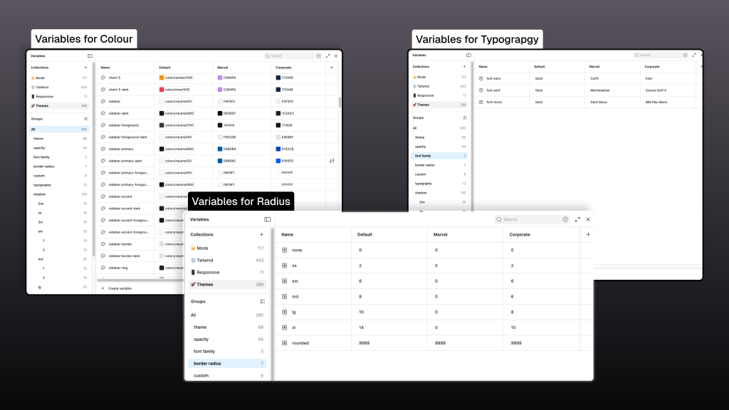
Colour Variables
Colour variables define where and how colour is used, not just what colour is used.
-
Backgrounds (app background, sidebar, chat surface) use predefined background variables.
-
Primary text (titles, messages) uses foreground text variables.
-
Secondary text (timestamps, hints, subtext) uses muted text variables.
-
Borders and dividers reference border colour variables.
This approach ensures that text contrast remains readable and that future theme changes (like dark mode) can be applied without redesigning the UI.
Typography Variables
Typography variables control text hierarchy, not individual font choices.
-
Titles and section headers use heading font variables.
-
Chat messages and body content use body text variables.
-
Helper text, placeholders, and timestamps use subtext variables.
-
Code blocks or technical responses use monospace variables.
By mapping each text type to a variable, the AI chat interface stays readable and consistent across long conversations.
Radius Variables
Radius variables define the visual tone of the interface.
-
Message bubbles, inputs, and cards use predefined radius tokens
-
Buttons and interactive elements follow the same radius scale
-
Fully rounded values are reserved for pills and indicators
This prevents inconsistent corner styles and keeps the UI visually cohesive.
Setting Up the Figma Canvas for an AI Chat App:
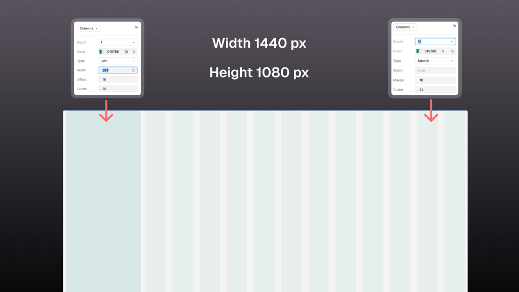
Moving forward with using Figma to design an app: AI chat apps are primarily desktop-first, so start with a 1440 × 1080 px frame in Figma. This size works well for modern screens and comfortably supports both navigation and conversation areas.
Use two grid systems to structure the layout:
-
Sidebar Grid (Left Panel):
-
Columns: 1
-
Type: Left
-
Width: 264 px
-
Offset (Margin): 16 px
-
Gutter: 20 px This grid is used for chat history, projects, and navigation, keeping secondary actions clearly separated from the main conversation.
-
-
Main Content Grid (Chat Area):
-
Columns: 12
-
Type: Stretch
-
Width: 264 px
-
Margin: 16 px
-
Gutter: 20 px This grid helps align chat messages, prompt tools, and response layouts while allowing flexibility for different content lengths.
-
Defining these grid values early creates a strong layout foundation, improves consistency, and reduces alignment issues as the design scales.
Designing the Sidebar with Colour and Typography
The sidebar serves as the primary navigation area of the AI chat app, helping users manage conversations and access key actions without disrupting the chat flow.
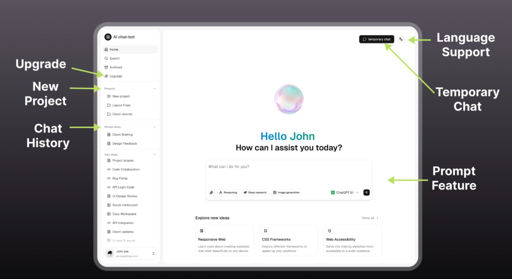
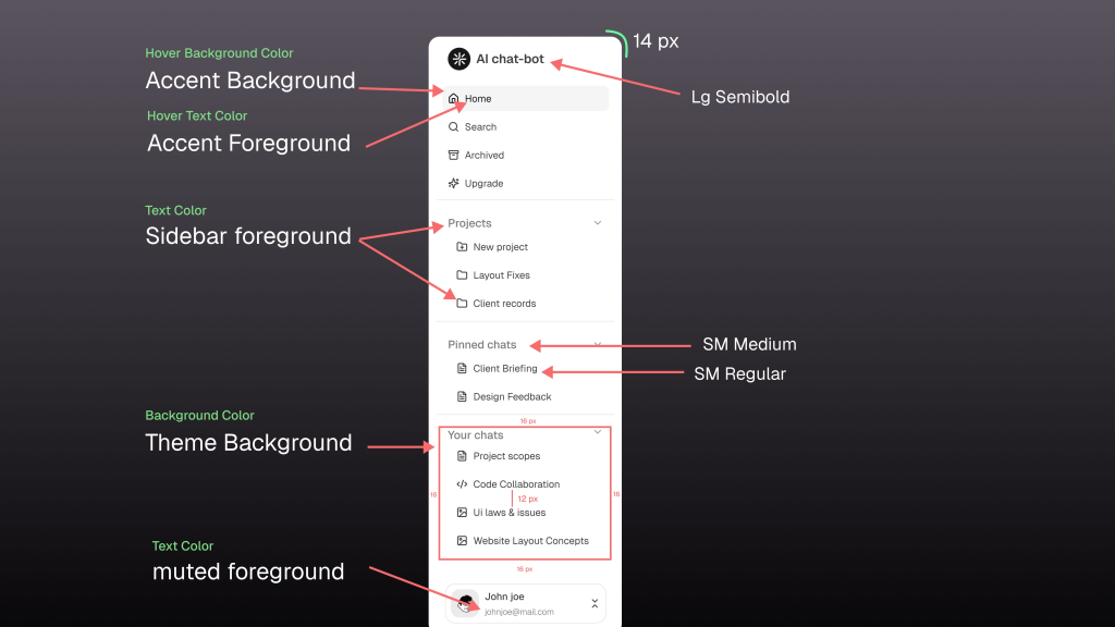
Sidebar Features
The sidebar includes the following core features:
-
New Chat / Home
-
Search
-
Archived Chats
-
Upgrade
-
Projects
-
Pinned Chats
-
Chat History (Your Chats)
These features allow users to quickly switch contexts, resume conversations, and manage ongoing work.
Colour Usage
The sidebar styling is entirely driven by colour variables:
-
Sidebar background uses Theme: Background
-
Primary navigation and chat items use: Sidebar Foreground
-
Secondary text and inactive items use: Muted Foreground
-
Hover and active states use: Accent Background with Accent Foreground text
This ensures clear visual feedback while keeping the sidebar visually subtle.
Typography & Spacing
Typography variables define hierarchy and readability:
-
App title uses LG Semibold (14px)
-
Section labels (e.g., Pinned Chats) use SM Medium
-
Chat items and navigation links use SM Regular
-
Consistent padding of 12–16px is used between items for clarity
Using predefined typography and spacing variables keeps the sidebar consistent, readable, and easy to scale as the app grows.
Designing the Chat Area and Explore More Sections
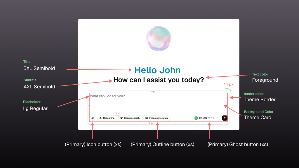
The chat input is the most frequently used interaction point in an AI chat app. Positioned at the bottom of the screen, it supports continuous typing, quick actions, and mode selection without breaking the user’s flow.
Chat Input Features
The chat input includes the following key features:
-
Text input field for writing prompts
-
Clear placeholder text to guide first-time users
-
Attachment/action icon button (Primary, XS)
-
Reasoning mode button (Primary Outline, XS)
-
Deep research button (Primary Outline, XS)
-
Image generation button (Primary Outline, XS)
-
Model selector (Primary Ghost, XS)
-
Send button (Primary Ghost, XS)
These features allow users to enhance prompts and control how the AI responds directly from the input area.
Typography Usage
Text hierarchy in the chat input is controlled using typography variables:
-
Main greeting title uses 5XL Semibold
-
Supporting subtitle uses 4XL Semibold
-
Input placeholder text uses LG Regular
-
All text uses the Foreground text colour variable
Colour & Surface Variables
The chat input relies on theme-based colour variables:
-
Input container background uses Theme Card
-
Input border uses Theme Border
-
Primary text uses Foreground
-
Placeholder and secondary text use Muted Foreground
Layout & Spacing
Spacing and sizing follow predefined layout tokens:
-
Inner padding of 16 px for comfortable typing
-
Vertical spacing of 14–16 px between elements
-
Border radius follows predefined radius variables
Using consistent variables across features ensures the chat input remains readable, flexible, and scalable as new capabilities are added.
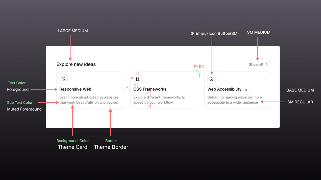
The Explore More section includes the following feature cards:
-
Responsive Web
-
CSS Frameworks
-
Web Accessibility
Typography Usage
Typography variables define hierarchy:
-
Section title (Explore More) uses Large Medium
-
Feature titles use Base Medium
-
Feature descriptions use SM Regular
-
Action text (Show all) uses SM Medium
Colour & Surface Variables
All feature boxes use theme variables:
-
The card background uses Theme Card
-
Card border uses Theme Border
-
Feature title text uses Foreground
-
Description text uses Muted Foreground
Layout & Spacing
-
Cards are arranged in a 2×2 grid
-
Inner padding is 14 px
-
Border radius follows predefined radius variables
Conclusion
Using Figma to design an app such as Shadcn Chat App is an exercise in restraint. The most effective designs quietly support the conversation instead of drawing attention to themselves. For inspiration, you can check the collection of the best Shadcn Chat App UI.
Using Shadcn Studio in Figma helps maintain consistency, scalability, and developer alignment. By focusing on layout, typography, and design variables, it is possible to create an AI chat interface that feels modern, readable, and easy to use.
When designing AI chat experiences, clarity should always take priority over complexity.