
Modern frontend workflows are rapidly evolving, and tools that simplify setup and scalability are becoming essential. shadcn/create is one such utility that streamlines project initialization by combining flexibility with a structured design system approach. Instead of relying on rigid templates, it provides a composable foundation that adapts to your needs.
In this guide, we’ll break down how shadcn/create works, step by step, and analyze the complete flow behind it.
What Is Shadcn/Create?
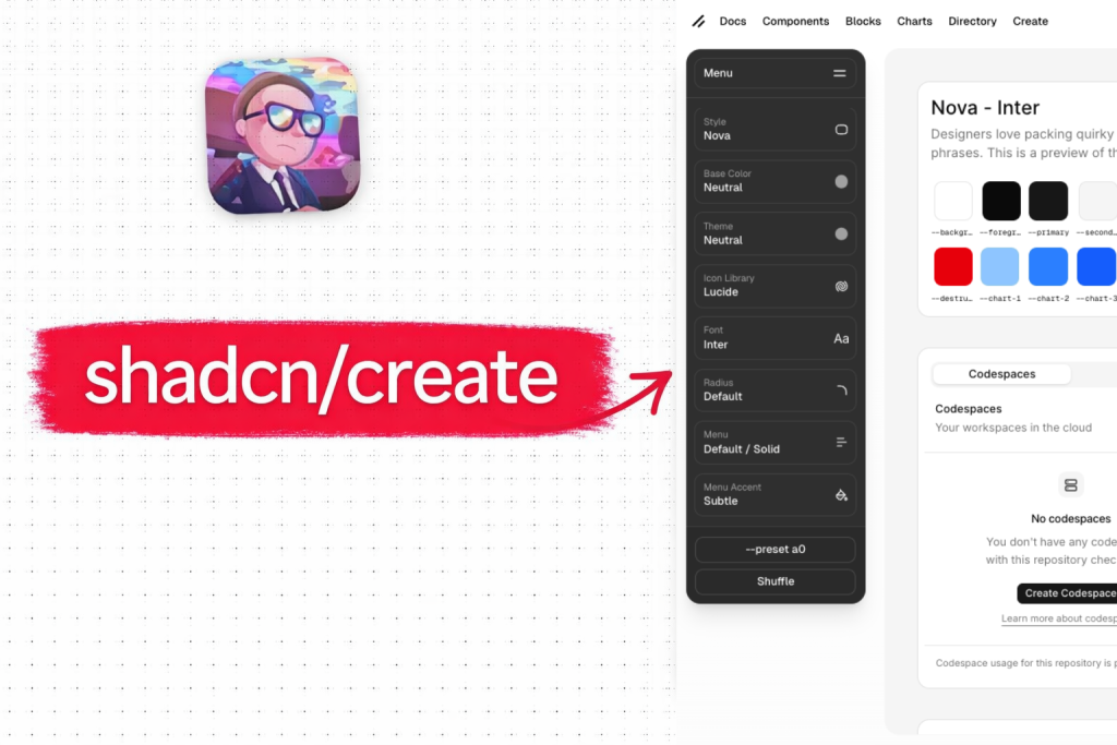
shadcn/create is a command-line tool for quickly setting up a new frontend project with a preconfigured design system and component architecture based on the shadcn ecosystem.
In simple terms, it helps you bootstrap a modern UI project without starting from scratch.
What shadcn/create actually does?
When you run shadcn/create, it:
-
Initializes a new project (e.g., Next.js, Vite, etc.)
-
Sets up Tailwind CSS and styling configs
-
Adds necessary dependencies
-
Configures project structure and aliases
-
Prepares your app to use shadcn components
The Complete Configuration Flow
The entire shadcn/create workflow is designed to convert simple UI selections into a fully functional design system with minimal effort.
At a high level, the process follows a data transformation pipeline:
-
User Input → Structured Config
-
Config → Encoded URL / Preset
-
URL → Parsed on Server
-
Parsed Config → Registry Objects
-
Registry → Project Files
What makes this powerful is that every step is deterministic; the same configuration will always generate the exact same output. This ensures:
-
Reproducibility across teams
-
Easy sharing via presets
-
Consistent design systems
Instead of generating static templates, the system dynamically builds your project based on modular registry items, making it far more flexible than traditional scaffolding tools.
User Interaction (Frontend)
User adjusts settings in the UI → Creates a DesignSystemConfig object:
{
  base: "radix",           // ← From "Base" dropdown
  style: "nova",           // ← From "Style" dropdown
  baseColor: "neutral",    // ← From "Base Color" dropdown
  theme: "neutral",        // ← From "Theme" dropdown
  iconLibrary: "lucide",   // ← From "Icon Library" dropdown
  font: "inter",           // ← From "Font" dropdown
  radius: "default",       // ← From "Radius" dropdown
  menuColor: "default",    // ← From "Menu Color" dropdown
  menuAccent: "subtle",    // ← From "Menu Accent" dropdown
  rtl: false,              // ← From RTL toggle
  template: "next-app"     // ← From template choice
}
Config Encoding (URL Generation)
The config gets encoded into a URL:
<https://ui.shadcn.com/init>?
  base=radix
  &style=nova
  &baseColor=neutral
  &theme=neutral
  &iconLibrary=lucide
  &font=inter
  &radius=default
  &menuColor=default
  &menuAccent=subtle
OR as a preset code:
<https://ui.shadcn.com/init?preset=a0>Server Processing (/init route)
File: ui/apps/v4/app/(create)/init/route.ts
export async function GET(request: NextRequest) {
  const searchParams = request.nextUrl.searchParams

  // Step 1: Parse config from URL params
  const result = parseDesignSystemConfig(searchParams)

  // Step 2: Build registry:base item
  const registryBase = buildRegistryBase(result.data)

  // Step 3: Return JSON
  return NextResponse.json(registryBase)
}
Building registry:base (buildRegistryBase)
This is the most critical step in the pipeline because it defines the foundation of your entire UI system.
The registry:base object acts as a blueprint that includes:
-
Component source mapping
-
Dependency list
-
Tailwind configuration
-
CSS variable injection
-
Style linking (
radix-nova, etc.)
File: ui/apps/v4/registry/config.ts
export function buildRegistryBase(config: DesignSystemConfig) {
  // A. Get component library metadata
  const baseItem = getBase(config.base)  // "radix" or "base"

  // B. Get icon library metadata
  const iconLibraryItem = getIconLibrary(config.iconLibrary)  // "lucide"

  // C. Build CSS variables (colors)
  const registryTheme = buildRegistryTheme(config)

  // D. Build dependencies
  const dependencies = [
    'shadcn@latest',
    'class-variance-authority',
    'tw-animate-css',
    ...baseItem.dependencies,      // Radix UI packages
    ...iconLibraryItem.packages    // lucide-react
  ]

  // E. Return registry:base item
  return {
    name: "radix-nova",
    type: "registry:base",
    config: {
      style: "radix-nova",         // ← CRITICAL: Points to pre-styled components
      iconLibrary: "lucide",
      rtl: false,
      menuColor: "default",
      menuAccent: "subtle",
      tailwind: {
        baseColor: "neutral"
      }
    },
    cssVars: {
      theme: { radius: "0.625rem", ... },
      light: { primary: "oklch(...)", background: "oklch(...)", ... },
      dark: { primary: "oklch(...)", background: "oklch(...)", ... }
    },
    dependencies: ["shadcn@latest", "lucide-react", "@radix-ui/react-*", ...],
    css: {
      '@import "tw-animate-css"': {},
      '@import "shadcn/tailwind.css"': {},
      "@layer base": { ... }
    }
  }
}
Building Theme CSS Variables (buildRegistryTheme)
File: ui/apps/v4/registry/config.ts
export function buildRegistryTheme(config: DesignSystemConfig) {
  // A. Get base color (neutral/stone/zinc/mauve/olive/mist/taupe)
  const baseColor = getBaseColor(config.baseColor)  // "neutral"

  // B. Get theme (same names as base colors + extended variants)
  const theme = getTheme(config.theme)  // "neutral"

  // C. Merge CSS variables from both
  const lightVars = {
    ...baseColor.cssVars.light,  // Base neutral colors
    ...theme.cssVars.light        // Theme-specific overrides
  }

  const darkVars = {
    ...baseColor.cssVars.dark,
    ...theme.cssVars.dark
  }

  // D. Apply transformations based on config
  if (config.menuAccent === "bold") {
    // Make accent colors match primary
    lightVars.accent = lightVars.primary
    lightVars["accent-foreground"] = lightVars["primary-foreground"]
  }

  if (config.radius !== "default") {
    lightVars.radius = RADII[config.radius].value
  }

  return {
    name: "neutral-neutral",
    type: "registry:theme",
    cssVars: {
      light: lightVars,
      dark: darkVars
    }
  }
}
Data Source Files
All configurations in shadcn/create are powered by centralized data registries, making the system highly maintainable and extensible.
Base Color Variables
File: ui/apps/v4/registry/themes.ts
export const THEMES = [
  {
    name: "neutral",
    type: "registry:theme",
    cssVars: {
      light: {
        background: "oklch(1 0 0)",
        foreground: "oklch(0.145 0 0)",
        primary: "oklch(0.205 0 0)",
        // ... 30+ CSS variables
      },
      dark: {
        background: "oklch(0.145 0 0)",
        foreground: "oklch(0.985 0 0)",
        // ...
      }
    }
  },
  // ... stone, zinc, mauve, olive, mist, taupe
]
Base colors are filtered:
export const BASE_COLORS = THEMES.filter(theme =>
  ["neutral", "stone", "zinc", "mauve", "olive", "mist", "taupe"].includes(theme.name)
)
Icon Library Data
File: ui/apps/v4/registry/config.ts
export const iconLibraries = {
  lucide: {
    name: "lucide",
    title: "Lucide",
    packages: ["lucide-react"]
  },
  hugeicons: {
    name: "hugeicons",
    title: "Hugeicons",
    packages: ["@hugeicons/react"]
  },
  // ... phosphor, tabler, eva
}
Font Data
File: ui/apps/v4/registry/fonts.ts
export const FONTS = [
  {
    name: "inter",
    provider: "google",
    css: "<https://fonts.googleapis.com/css2?family=Inter:wght@400;500;600;700&display=swap>",
    variable: "--font-sans"
  },
  // ... geist, figtree, jetbrains-mono, etc.
]
Configuration Mapping Table
The mapping table is crucial because it connects user-facing options to actual implementation details.
| UI Field | Config Key | Data Source File | Applied To | Result |
|---|---|---|---|---|
| Base | base | registry/bases.ts | components.json | Determines component library (Radix/Base) |
| Style | style | registry/styles.tsx | components.json → registry path | Selects pre-styled components (nova/vega/lyra/maia/mira) |
| Base Color | baseColor | registry/themes.ts (filtered) | globals.css | Base color palette (neutral/stone/zinc/etc) |
| Theme | theme | registry/themes.ts | globals.css | Color theme variations |
| Icon Library | iconLibrary | registry/config.ts (iconLibraries) | package.json + components.json | Icon package to install |
| Font | font | registry/fonts.ts | layout.tsx + app/font-*.ts | Font files to load |
| Radius | radius | registry/config.ts (RADII) | globals.css (—radius) | Border radius value |
| Menu Color | menuColor | config only | components.json | Menu color scheme |
| Menu Accent | menuAccent | config only | globals.css (accent vars) | Bold = accent matches primary |
What Gets Written to the User’s Project
After all processing, the system generates a fully functional project setup. But importantly, it does not lock you in.
components.json
{
  "$schema": "<https://ui.shadcn.com/schema.json>",
  "style": "radix-nova",              // ← From base + style
  "iconLibrary": "lucide",            // ← From icon library
  "rtl": false,
  "menuColor": "default",
  "menuAccent": "subtle",
  "tailwind": {
    "config": "tailwind.config.ts",
    "css": "app/globals.css",
    "baseColor": "neutral",           // ← From base color
    "cssVariables": true,
    "prefix": ""
  },
  "aliases": {
    "components": "@/components",
    "utils": "@/lib/utils",
    "ui": "@/components/ui"
  }
}
app/globals.css
@import "tailwindcss";
@import "tw-animate-css";
@import "shadcn/tailwind.css";

@layer base {
  * {
    @apply border-border outline-ring/50;
  }
  body {
    @apply bg-background text-foreground;
  }
}

:root {
  --background: oklch(1 0 0);              /* ← From theme */
  --foreground: oklch(0.145 0 0);          /* ← From theme */
  --primary: oklch(0.205 0 0);             /* ← From theme */
  --radius: 0.625rem;                       /* ← From radius */
  /* ... 30+ more variables */
}

.dark {
  --background: oklch(0.145 0 0);          /* ← From theme.dark */
  --foreground: oklch(0.985 0 0);          /* ← From theme.dark */
  /* ... */
}
package.json
{
  "dependencies": {
    "shadcn": "latest",
    "lucide-react": "^0.x.x",              // ← From icon library
    "@radix-ui/react-*": "^1.x.x",         // ← From base
    "class-variance-authority": "^0.x.x",
    "tw-animate-css": "^0.x.x"
  }
}
app/layout.tsx (if font selected)
import { Inter } from 'next/font/google'

const inter = Inter({ subsets: ['latin'], variable: '--font-sans' })

export default function RootLayout({ children }) {
  return (
    <html lang="en" className={inter.variable}>
      <body>{children}</body>
    </html>
  )
}
components/ui/button.tsx
// Fetched from registry/radix-nova/ui/button.tsx
// Already has nova-style classes baked in:

<button className="rounded-lg h-8 px-3 text-sm font-medium" />
Note: The component has rounded-lg h-8 px-3 because it was pre-generated from style-nova.css
Special Mention: Shadcn Studio
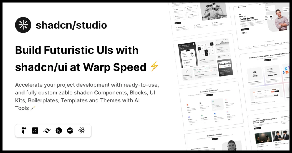
Shadcn Studio goes beyond animations by providing animated blocks and sections built on top of Shadcn UI. It’s perfect for teams that want speed without compromising design quality.
Key Features:
-
Pre-animated components, blocks, and layouts
-
Built specifically for Shadcn UI
-
Consistent motion patterns
-
Great for marketing and landing pages
Furthermore, Animated variants with motion add smooth, modern animations to your components, enhancing user experiences with minimal effort.
Best For: Startups, agencies, and rapid MVP development.
Additionally, it comes with the following features:
-
Open-source: Dive into a growing, community-driven collection of copy-and-paste shadcn UI components, Shadcn blocks, and templates.
-
Component & Blocks variants: Access a diverse collection of customizable shadcn blocks and component variants to quickly build and style your UI with ease.
-
Landing pages & Dashboards: Explore 20+ premium & free Shadcn templates for dashboards, landing pages & more. Fully customizable & easy to use.
-
shadcn/ui for Figma: Speed up your workflow with Shadcn Figma UI kit with components, blocks & templates – a full design library inspired by shadcn/ui.
-
Powerful theme generator: Customize your UI instantly with Shadcn Theme Generator. Preview changes in real time and create consistent, on-brand designs faster.
-
shadcn/studio MCP: Integrate shadcn/studio MCP Server directly into your favorite IDE and craft stunning shadcn/ui Components, Blocks, and Pages inspired by shadcn/studio.
-
Shadcn Figma To Code Plugin: Convert your Figma designs into production-ready code instantly with the Shadcn Figma Plugin.
Conclusion:
shadcn/create represents a shift from traditional scaffolding to a more config-driven, composable frontend workflow. Instead of locking you into rigid templates, it builds your project dynamically using a structured registry system and design tokens.
What makes it particularly powerful is how it separates concerns cleanly:
-
Configuration defines intent
-
The registry defines the structure
-
Output files define implementation
This layered approach ensures that your project is not only quick to set up but also easy to scale, customize, and maintain over time.
By understanding the internal flow from user input to registry:base theme generation and final file output, you gain deeper control over how your design system is constructed. This allows you to go beyond just using the tool and start extending and adapting it to your own workflows.
In short, shadcn/create doesn’t just generate a project; it gives you a flexible foundation for building consistent, modern UI systems with full ownership and zero abstraction lock-in.