Shadcn UI has become a popular choice for building modern, accessible, and Tailwind-powered user interfaces in React projects. But it’s not the only game in town. Whether you’re looking for more components, broader design systems, or different styling philosophies, there are excellent alternatives worth considering.
In this article, we explore some of the best Shadcn alternatives, from lightweight headless libraries to full-featured UI frameworks. Each option is evaluated on flexibility, ecosystem support, accessibility, and developer experience.
Table of Contents
What to Look for in Shadcn Alternatives
Before jumping into the list, here are some criteria developers commonly consider when choosing a UI toolkit:
- Component coverage – How many ready-made components are provided?
- Styling approach – Tailwind-first, CSS-in-JS, unstyled, or opinionated?
- Accessibility – ARIA, keyboard navigation, and best practices built in.
- Customization – How easy is it to adapt components to your design system?
- Ecosystem & community – Plugins, templates, and community support.
Best Shadcn Alternatives
Shadcn UI is a strong foundation, but different projects have different needs. The best Shadcn alternatives range from headless libraries to full UI frameworks, each offering unique trade-offs in styling, flexibility, and ecosystem support.
Exploring these options helps you choose a UI toolkit that better aligns with your workflow, design requirements, and long-term scalability goals.
Here are some of the best Shadcn alternatives you can consider based on different UI needs and project requirements
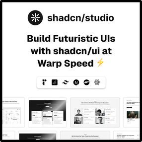
shadcn/studio

shadcn/studio isn’t a traditional component library or a replacement for Shadcn. Instead, it’s a unique collection that offers customizable variants of components, blocks, and templates. Preview, customize, and copy-paste them into your apps with ease.
Building on the solid foundation of the Shadcn components & blocks, we’ve enhanced it with custom-designed components & blocks to give you a head start. This allows you to craft, customize, and ship your projects faster and more efficiently.
Features:
- Open-source: Dive into a growing, community-driven collection of copy-and-paste shadcn ui components, Shadcn blocks, and templates.
- Component & Blocks variants: Access a diverse collection of customizable shadcn blocks and component variants to quickly build and style your UI with ease.
- Animated variants with Motion: Add smooth, modern animations to your components, enhancing user experiences with minimal effort.
- Landing pages & Dashboards: Explore 20+ premium & free Shadcn templates for dashboards, landing pages & more. Fully customizable & easy to use.
- shadcn/ui for Figma: Speed up your workflow with Shadcn Figma UI components, blocks & templates – a full design library inspired by shadcn/ui.
- Powerful theme generator: Customize your UI instantly with Shadcn Theme Generator. Preview changes in real time and create consistent, on-brand designs faster.
- shadcn/studio MCP: Integrate shadcn/studio MCP Server directly into your favorite IDE and craft stunning shadcn/ui Components, Blocks, and Pages inspired by shadcn/studio.
- Shadcn Figma To Code Plugin: Convert your Figma designs into production-ready code instantly with the Shadcn Figma Plugin.
Pricing:
- Free / Open Source
- One-time Paid subscriptions
- Basic: $149
- Pro: $249
- team: $499
- Enterprise: $899
Best for:– Shadcn UI users who want ready-made templates and UI blocks without sacrificing customization.
Why shadcn/studio is a good Shadcn UI alternative
Shadcn/Studio builds directly on the Shadcn philosophy while addressing one of its main gaps: the lack of ready-made layouts. It’s a strong alternative when you want to stay within the Shadcn ecosystem but move faster with templates and UI blocks.
Radix UI

Radix UI is a headless React library focused on accessibility and interaction behavior. It provides low-level primitives instead of styled components. The library is built for teams that want total control over UI structure and design. Accessibility and keyboard behavior are handled internally.
Key Features:-
- Accessible UI primitives
- No enforced styling
- Works with Tailwind, CSS-in-JS, or CSS
- Ideal for design systems
- MIT license
Pricing
- Free / Open Source
Best for:- Teams building custom, accessibility-first UI foundations.
Why Radix UI is a good Shadcn UI alternative
Radix UI sits one level below Shadcn UI and gives you complete control over structure and styling. It’s a better choice when you want Shadcn-like accessibility and behavior without pre-styled components.
To understand where both Radix & Shadcn UI stand, go through the detailed blog on Radix vs Shadcn UI.
Preline UI
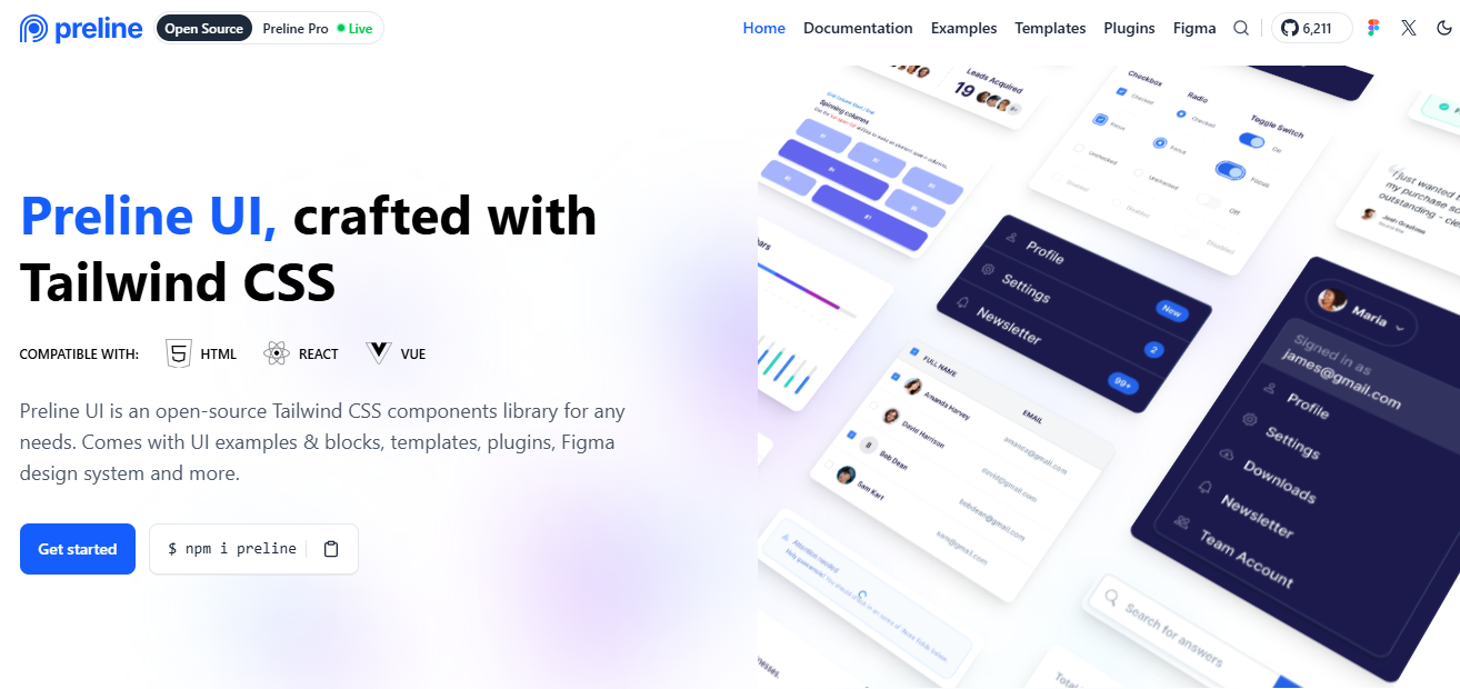
Preline UI is a Tailwind-first component library designed for rapid interface development. It provides ready-to-use UI elements styled with utility-first conventions. The library is lightweight and easy to integrate into existing Tailwind projects. It reduces setup time while maintaining simplicity in customization.
Key Features
- Tailwind-based components
- Interactive UI blocks
- Dark and light mode support
- Minimal configuration
- MIT license
Pricing:-
- Free / Open Source
- Paid subscriptions: one-time payment
- Pro: $249
- Team: $459
- Enterprise: Custom
Best for:- Tailwind developers who want quick, adaptable components.
Why Preline UI is a good Shadcn UI alternative
Preline UI offers pre-styled Tailwind components, making it faster to adopt than Shadcn UI for many projects. It’s a solid alternative when speed and simplicity matter more than granular customization.
DaisyUI
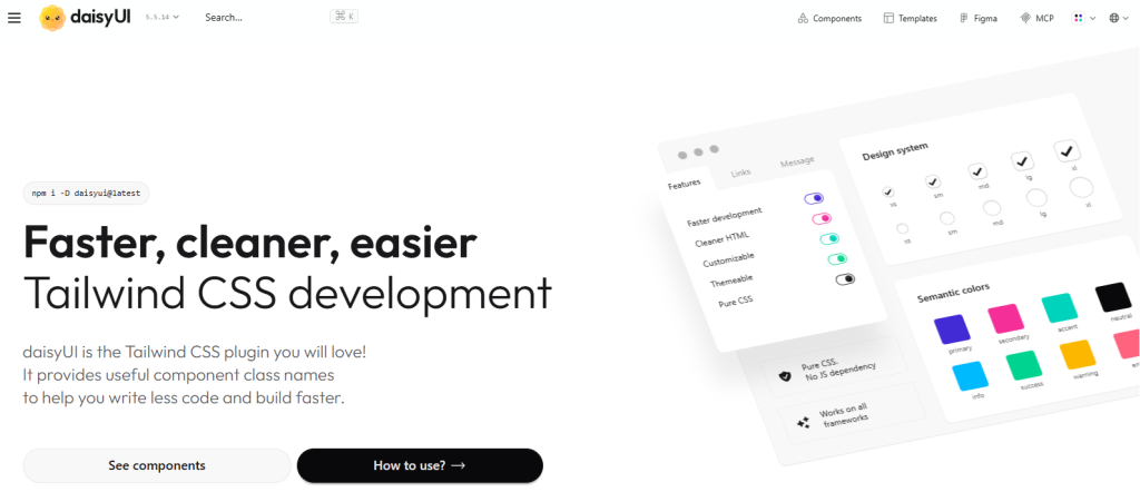
DaisyUI extends Tailwind CSS with pre-styled, themeable components. It works as a Tailwind plugin rather than a standalone UI framework. The library simplifies theming while staying close to Tailwind utilities.
It’s easy to adopt without changing existing setups.
Key Features:-
- Themeable component classes
- Large component set
- No extra CSS files
- Tailwind-native workflow
- MIT license
Pricing:-
- Free / Open Source
Best for: Tailwind projects needing themeable UI out of the box.
Why DaisyUI is a good Shadcn UI alternative
DaisyUI simplifies Tailwind development by providing ready-made, themeable components. It’s a good alternative when you prefer predefined styles instead of composing UI from lower-level Shad
Headless UI
Headless UI provides unstyled, accessible UI components created by the Tailwind Labs team. It focuses purely on behavior and accessibility. The components are designed to be styled by developers. It pairs naturally with Tailwind for custom UI designs.
Key Features:-
- Fully unstyled components
- Built-in accessibility handling
- Keyboard and focus management
- Tailwind-friendly APIs
- MIT license
Pricing:-
- Free / Open Source
Best for: Projects that want accessibility without visual opinions.
Why Headless UI is a good Shadcn UI alternative
Headless UI focuses purely on accessibility and interaction logic, similar to Shadcn UI’s underlying principles. It’s a strong alternative when you want full control over styling while relying on battle-tested accessibility behavior.
Aceternity UI
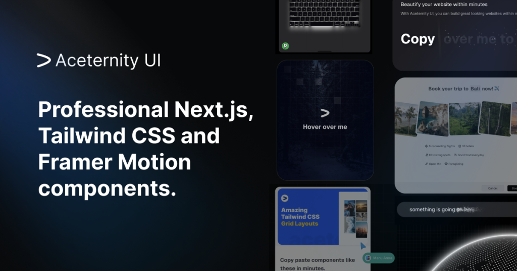
Aceternity UI is a Tailwind-driven component library with a clean, minimal design approach. It provides common UI elements without heavy styling constraints. The library focuses on simplicity and ease of customization. It’s suited for teams that want a straightforward UI foundation.
Key Features:-
- Tailwind-first components
- Minimal visual style
- Dark mode support
- Easy customization
Pricing:-
- Free / Open Source
- Paid subscriptions
- Annual Access: $169
- Lifetime Access: $199
- Team One-time Purchase: $1590
Best for: Developers who want simple, clean Tailwind UI components.
Why Aceternity UI is a good Shadcn UI alternative
Aceternity UI offers a simpler, more opinionated component set compared to Shadcn UI. It’s a good choice when you want clean Tailwind components without managing complex composition patterns.
TweakCN
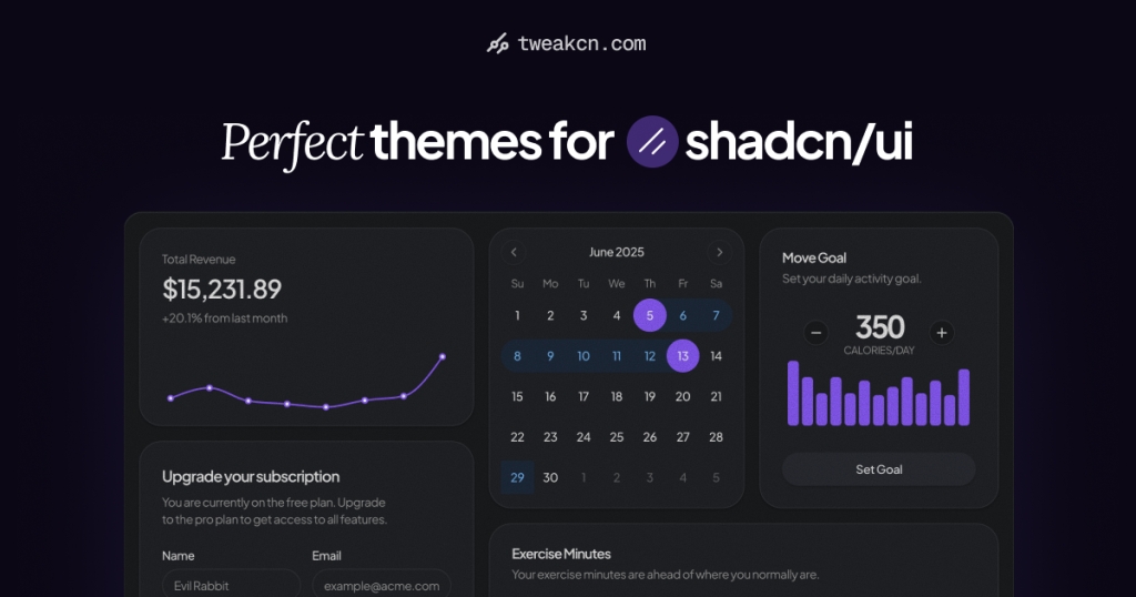
TweakCN is a utility-first styling toolkit built on Tailwind principles, designed to help teams create flexible, scalable design systems. Instead of offering prebuilt components, it focuses on providing strong styling foundations that can be customized and extended over time.
Key Features:-
- Customizable styling utilities
- Design-system-friendly
- Tailwind integration
- Flexible theming
Pricing:-
- Free / Open Source
- Paid subscriptions: $8/month
Best for: Teams building long-term, custom design systems.
Why TweakCN is a good Shadcn UI alternative
TweakCN shifts focus from components to styling foundations, making it useful when Shadcn UI feels too component-centric. It’s better suited for teams building long-term, flexible design systems.
Hero UI

Hero UI is a lightweight component library focused on clean, modern interfaces. It integrates seamlessly with Tailwind-based workflows and keeps its APIs intentionally simple, avoiding unnecessary complexity.
This makes it a solid choice for small to medium-sized projects that value clarity and ease of use.
Key Features:-
- Minimal component set
- Light and dark themes
- Tailwind utility integration
- Simple APIs
- MIT license
Pricing:-
- Free / Open Source
- Paid subscriptions: one-time payment
- Solo Plan: $249
- Startup Plan: $399
- Organization Plan: $799
Best for: Developers who prefer minimal, modern UI foundations.
Why Hero UI is a good Shadcn UI alternative
Hero UI provides a lighter and more minimal approach than Shadcn UI. It works well when you want fewer abstractions and a smaller, easier-to-maintain component surface.
Franken-UI
Franken-UI is a composable UI toolkit built with flexibility and accessibility in mind. It provides unstyled building blocks instead of finished components. The toolkit supports multiple styling approaches. It gives teams full control over structure and presentation.
Key Features:-
- Headless, composable components
- Accessibility defaults included
- Works with Tailwind or custom CSS
- Design-system friendly
- MIT license
Pricing:-
- Free / Open Source
Best for: Teams that want maximum control without enforced styles.
Why Franken-UI is a good Shadcn UI alternative
Franken-UI emphasizes composable, unstyled primitives, offering more structural freedom than Shadcn UI. It’s ideal when you want complete control over layout and styling without predefined patterns.
Conclusion
Shadcn UI is a powerful foundation for building modern, accessible interfaces, but it’s not a one-size-fits-all solution. Depending on your project goals, team workflow, and design requirements, alternatives like headless UI libraries, Tailwind-first component kits, or full UI frameworks may offer a better fit.
By exploring these Shadcn UI alternatives, you can choose a UI library that aligns with your need for flexibility, customization, accessibility, or development speed. The right choice ultimately depends on whether you prioritize full control, ready-made components, or scalable design systems for long-term growth and success.